New Case Study: One Story Website

When The Meeting House rebranded One Story (their youth and children’s Bible curriculum) in 2020, they asked me to design a website that captured their mission. They believe that children and youth are a key part of the Kingdom of God. Every part of my design reinforces that mission.

The site relies heavily on image collages. Each image focuses mostly on a single young person, but taken as a whole, the collages represent the church body.

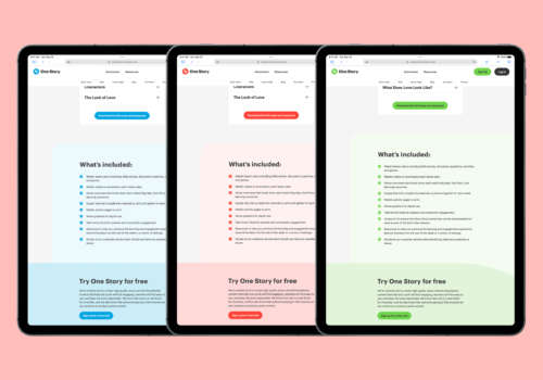
Colour is used heavily throughout the site as a sort of way-finding element. Their new brand used colour to differentiate between different curriculum tiers, and so I sprinkled that throughout the site.
Finally, the site uses gentle curves borrowed from the “S” in the One Story logo for many of its section breaks, and even in subtle ways in some of its collage layouts. This ties together the visuals nicely, but it’s my belief it subconsciously creates and increases trust among visitors.
Feedback from the site has been very positive. This is what one of the project managers said about the project later:
“Nathan has been a dream to work with from the beginning to end of our project. He not only designed and built a beautiful, creative and functional website that met our objectives, but he was able to partner with our team right from the beginning to understand what we wanted to accomplish through the project and partnered with us to come up with the best solutions to get us there. From creative designs to writing in copy to fill our gaps, he wasn’t just trying to get the job done, it felt like he had joined our team and was working with us to achieve our objective.”
Check out many, many more images and learn more about One Story’s website in the case study.