The brief
One Story is the popular kids and youth curriculum program for churches. Their curriculum includes toddlers through senior high, each one uniquely branded, and dedicates much of its resources to properly equipping leaders in the church. When they rebranded One Story, they asked me to help design the product, and design and develop a new marketing website to go along with it.
This case study covers my work on the marketing website. The product is available for paying customers only, so I cannot share its contents.
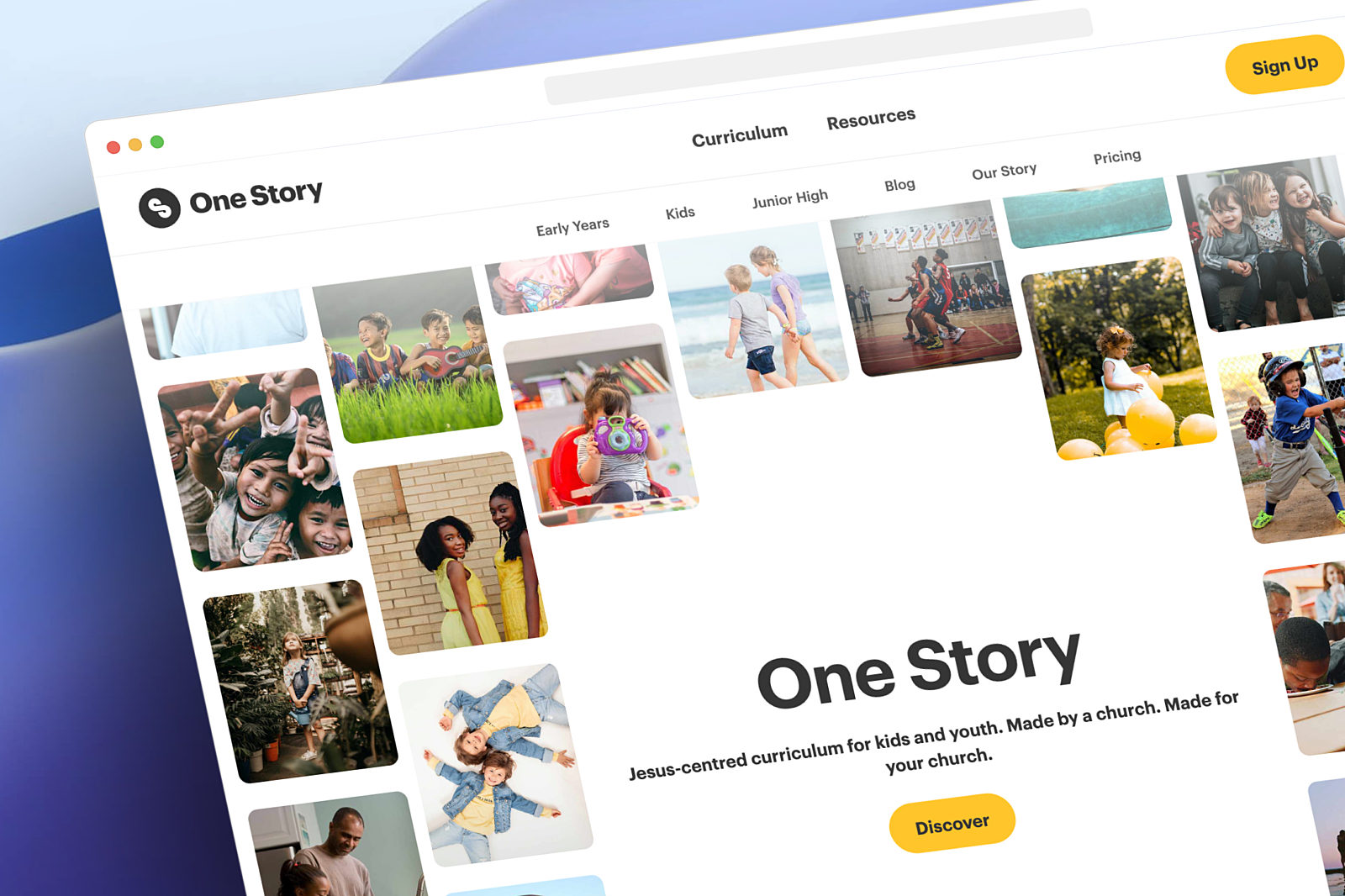
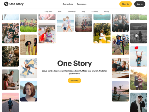
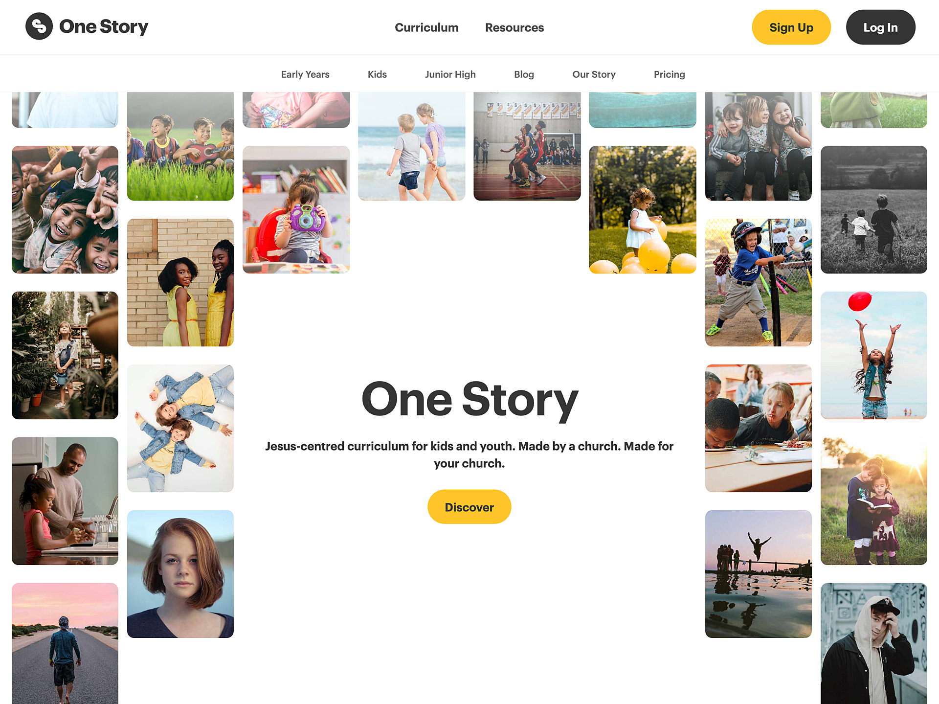
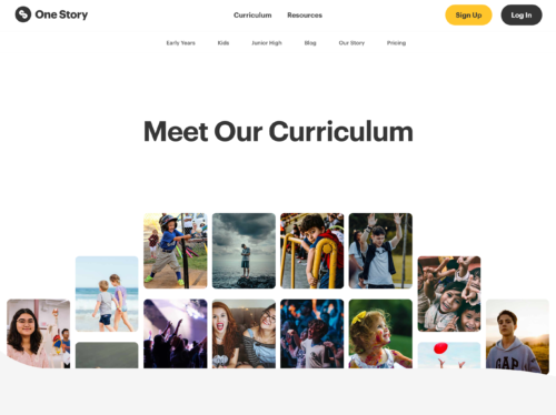
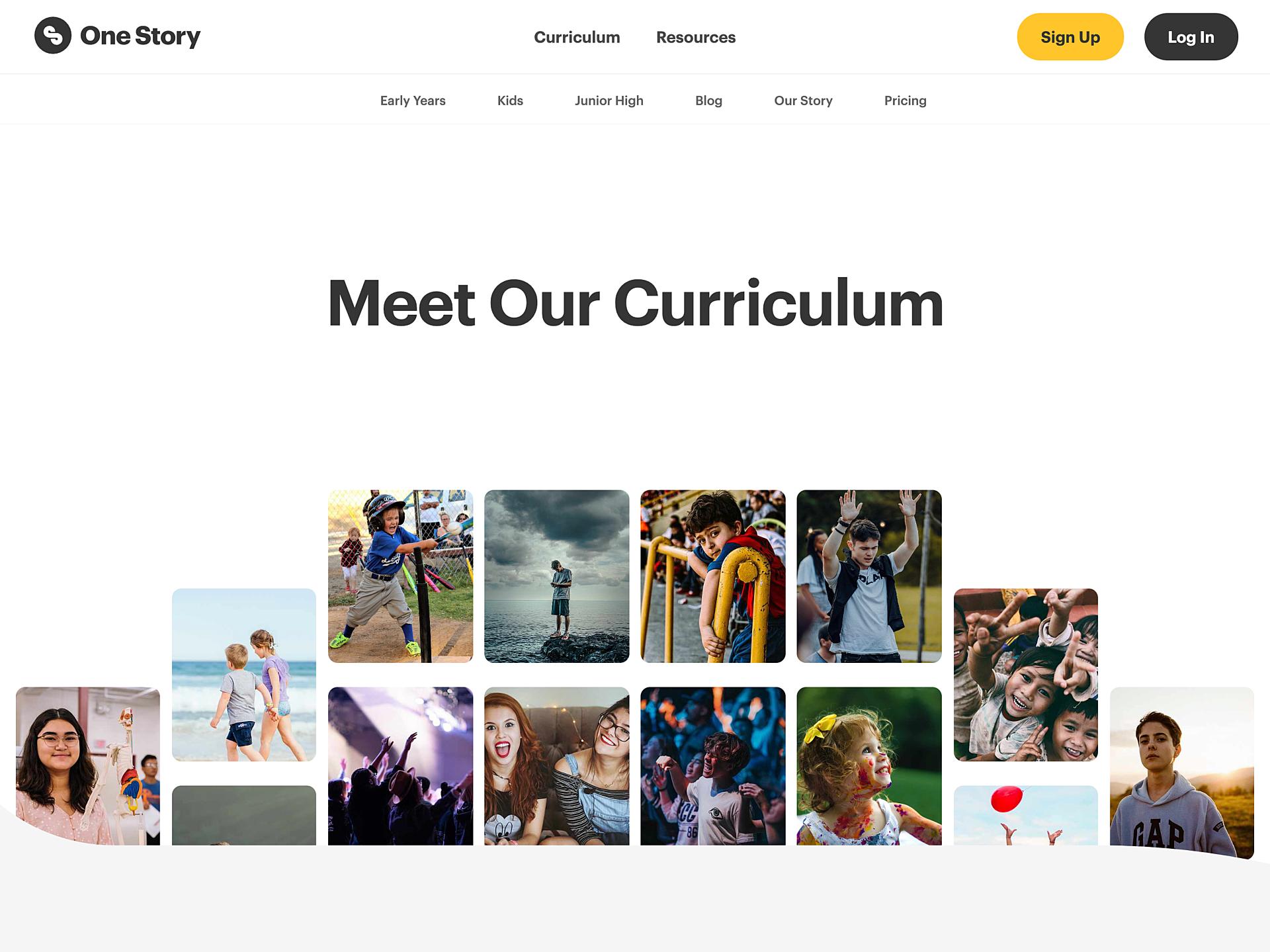
One story, many collages
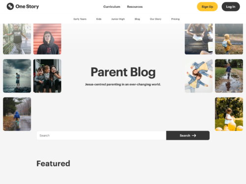
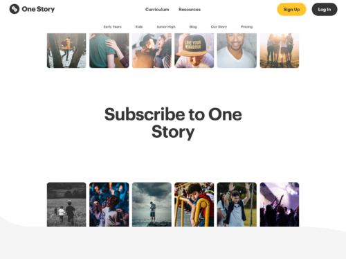
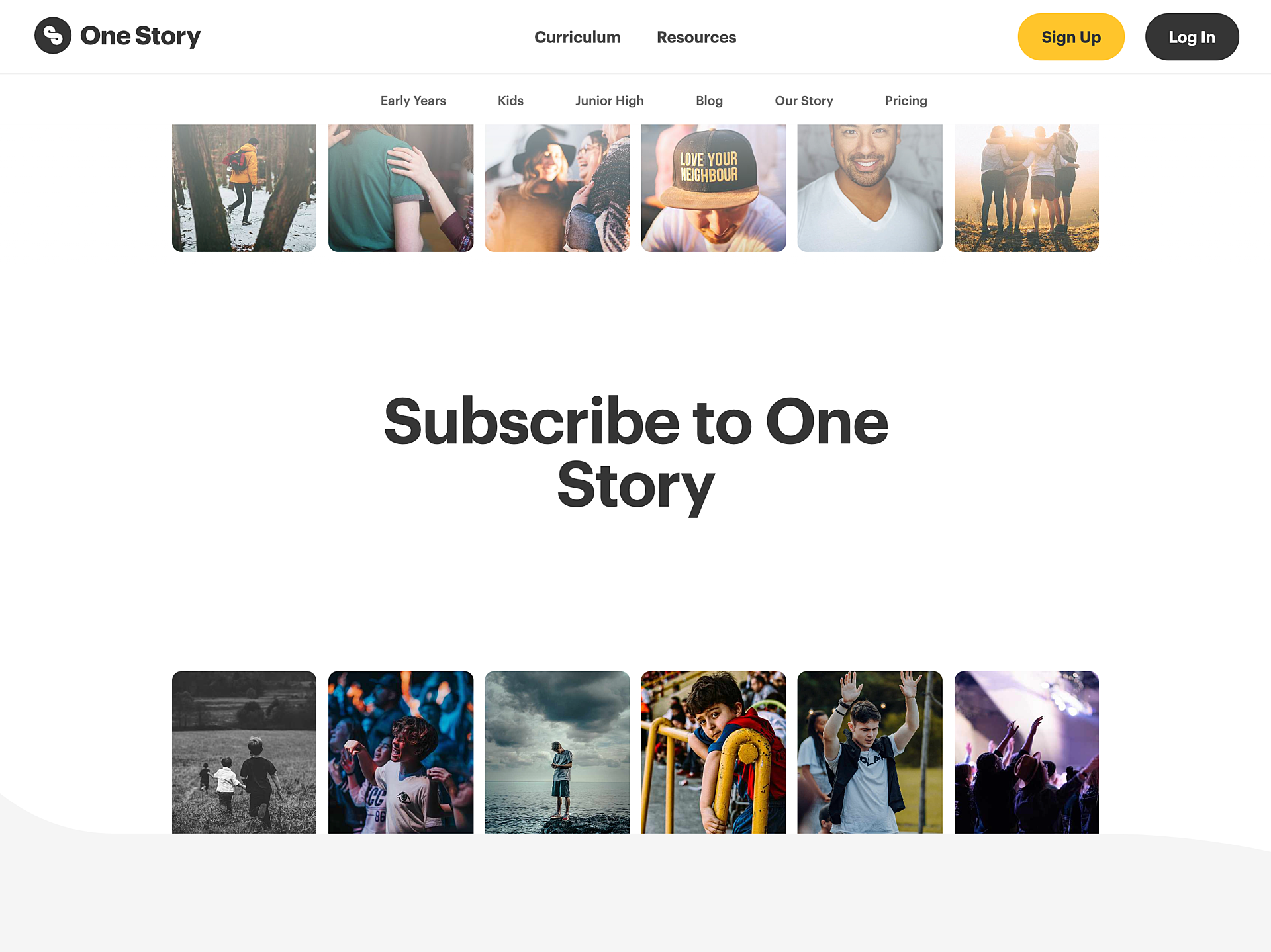
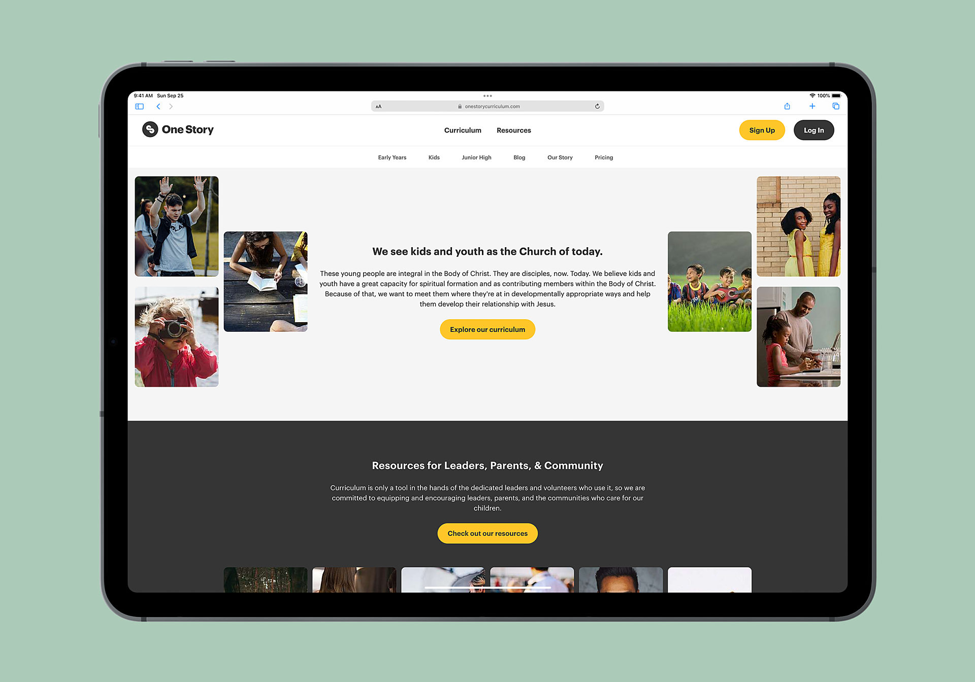
Telling one story with photos. Lots of photos. One Story’s website uses collages to show individual stories of children and youth coming together to become “one story” as part of the Kingdom of God. There are over a dozen different collage styles for the page header alone, and many collage styles for sections within individual pages as well.
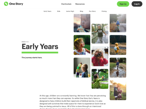

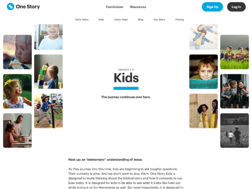
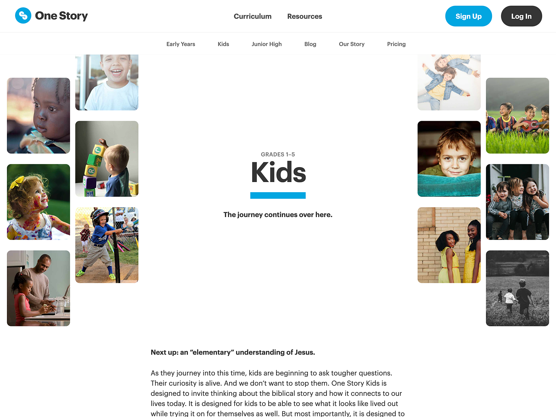


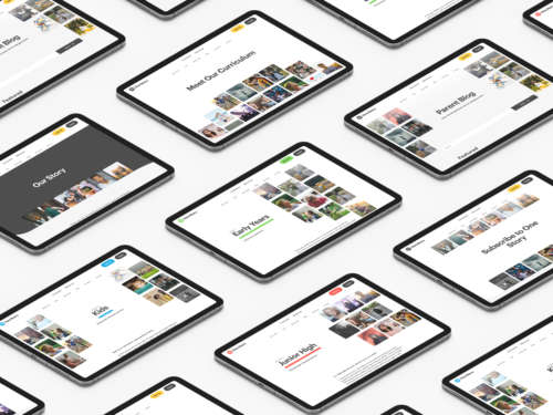
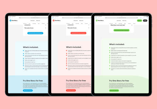
Landing pages that are designed to convert
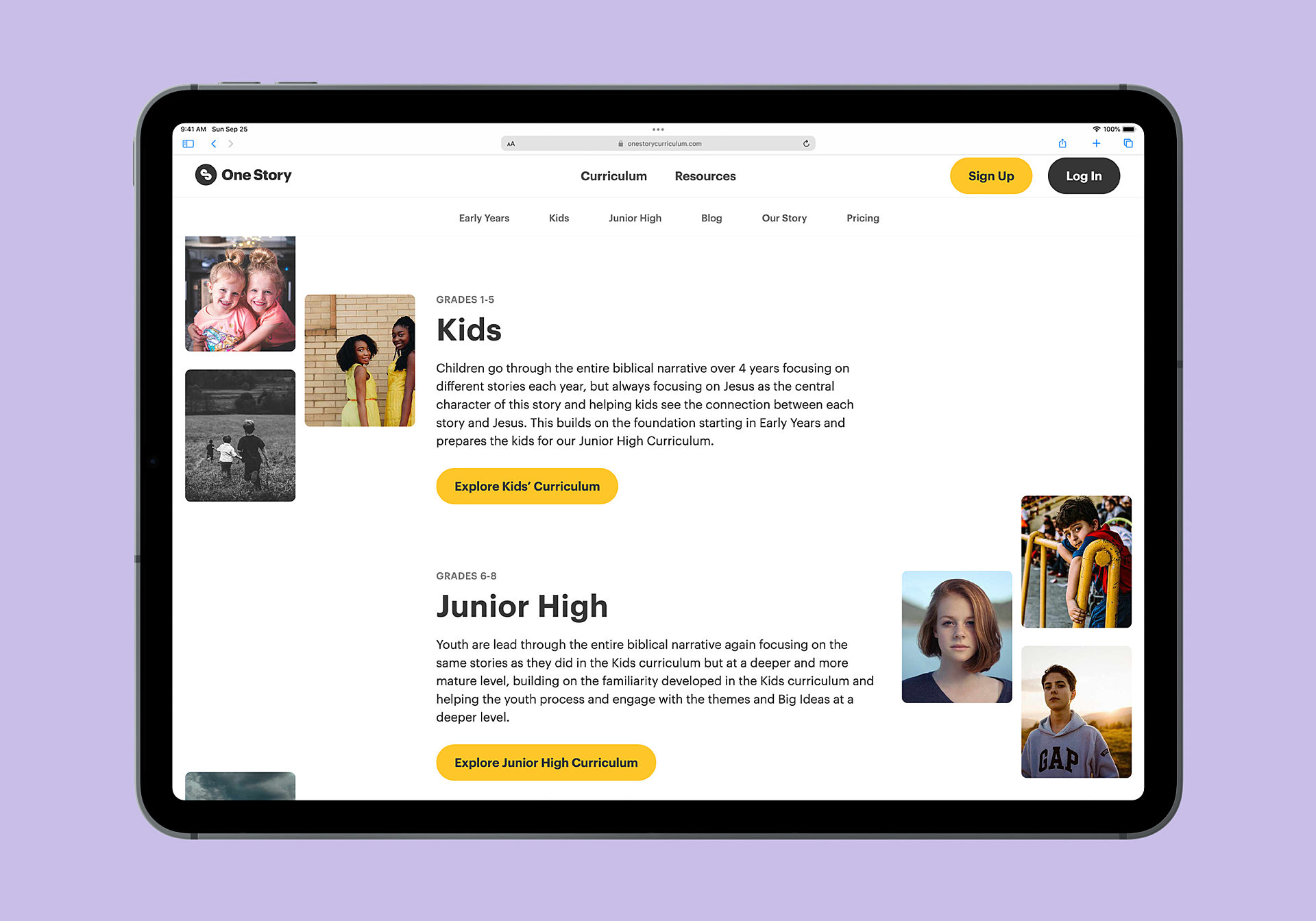
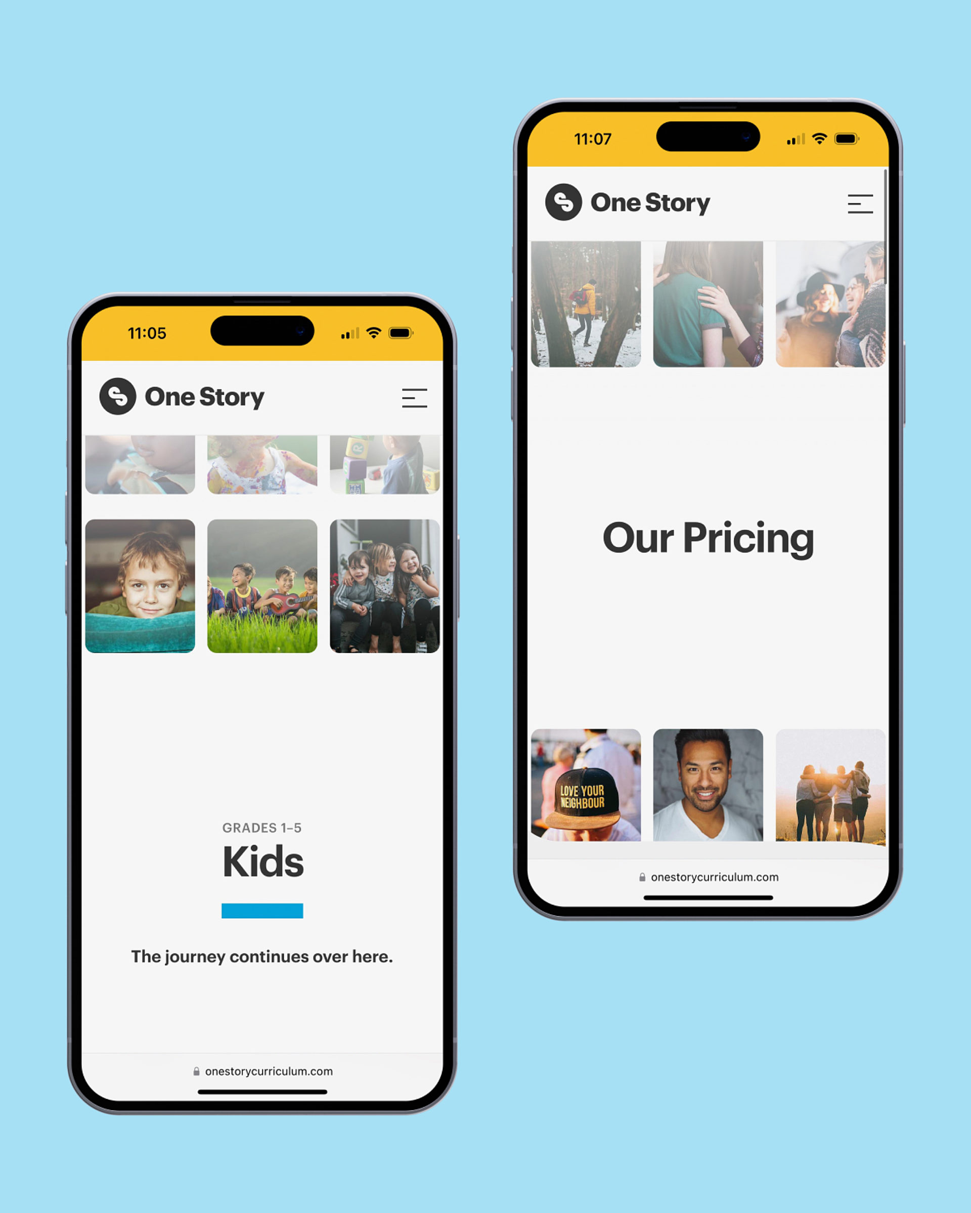
Designed for conversion. One Story’s curriculum is broken down by age bracket. For each age bracket, the website generates a landing page designed for conversion. These landing pages include a custom page header, introductory videos and walkthroughs of the curriculum, the scope and sequence for every year of that age bracket, a list of everything that’s included, and a call to action. These pages even have their own colour schemes, so One Story Kids and One Story Junior High can have unique brand elements.
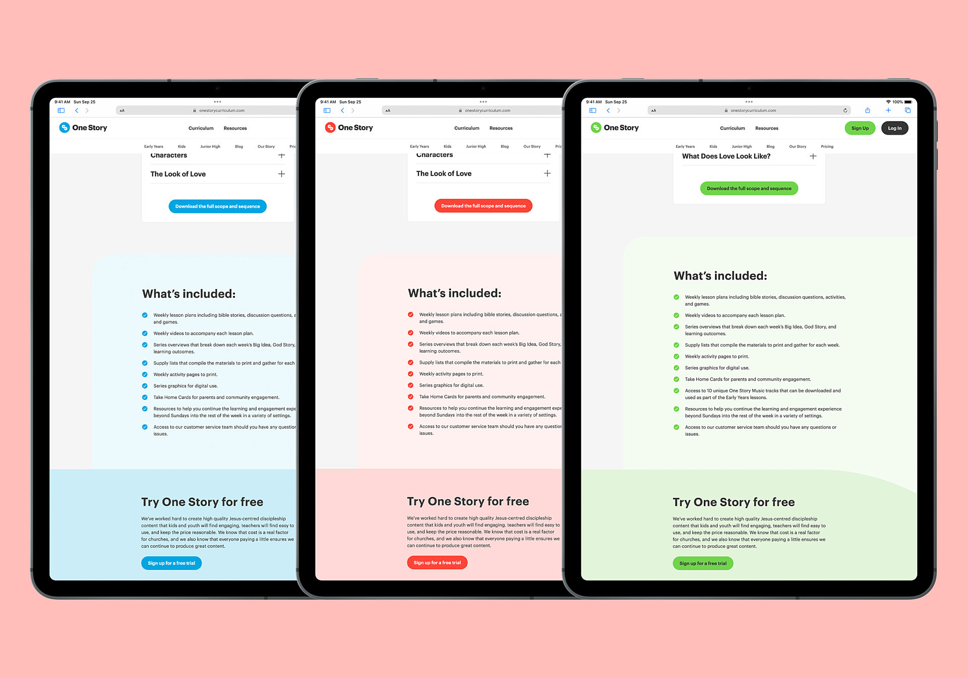
One Story’s website doesn’t rely only on images for its impact. It also uses colour to differentiate between curriculum tiers (curriculum for Kids has a different tint than curriculum for Jr. High). Finally, the“S” in their logo is weaved throughout the site, with the curved elements of the“S” playing a large role — the reader feels almost like they’re reading content that exists inside the logo itself.

Loading dozens of images for a page header alone could dramatically slow down the website. To get around this, One Story’s website automatically creates multiple different size variants of each uploaded image. It loads the smallest possible version of each image, depending on the size of your screen, and only loads the images when they’re in view — so the site only loads what it needs to. This keeps the website blazing fast, no matter where or how it’s viewed.
“My team asks for Nathan anytime we need software help. We can always expect excellence, professionalism, and ease when we work with him. His designs never fail to amaze with clarity and beauty and his code does everything we need and more. I would recommend Nathan in an instant.”
Lucas Belem The Meeting House
A flexible CMS
The One Story website is easy to work with. The team can easily add new pages with a huge variety of components, page header styles, and more. One Story’s creative team can choose from accordions, image and video carousels, product listings, featured resources resources and posts, testimonials, and much more. This gives One Story’s team of creative people an astounding amount of breathing room for their own art direction. No two pages ever have to be alike.

The website has enough layout options that each page remains visually unique, while remaining a part of a cohesive whole.

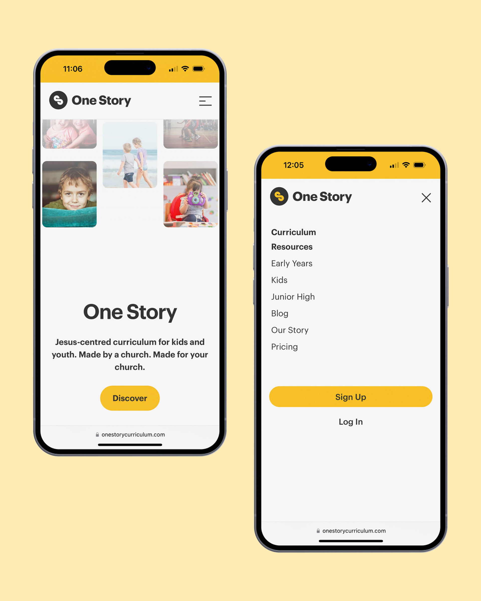
The complexity of the user interface on a desktop scales down beautifully to mobile.

On mobile, alternative image layouts are used for page headers that reduce the number of visible images so the site stays speedy.
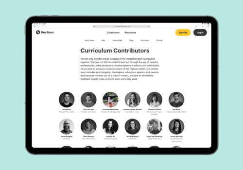

Even small elements, like the images of the curriculum contributors, contain tiny Easter eggs. Hovering over any of the black and white contributors' photos reveals a photo from their childhood in full colour. After all, we were all kids once!
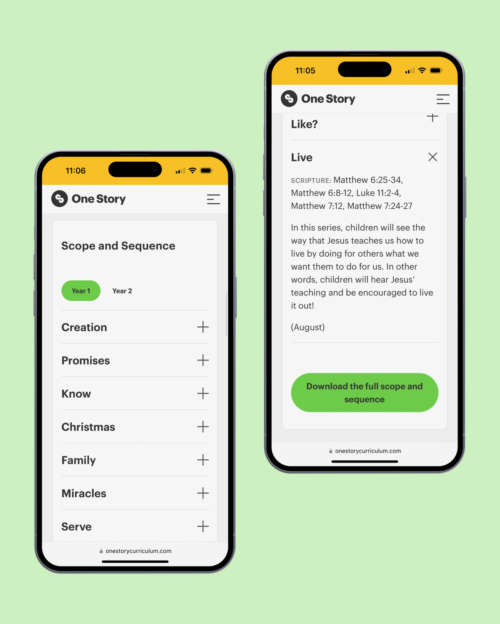
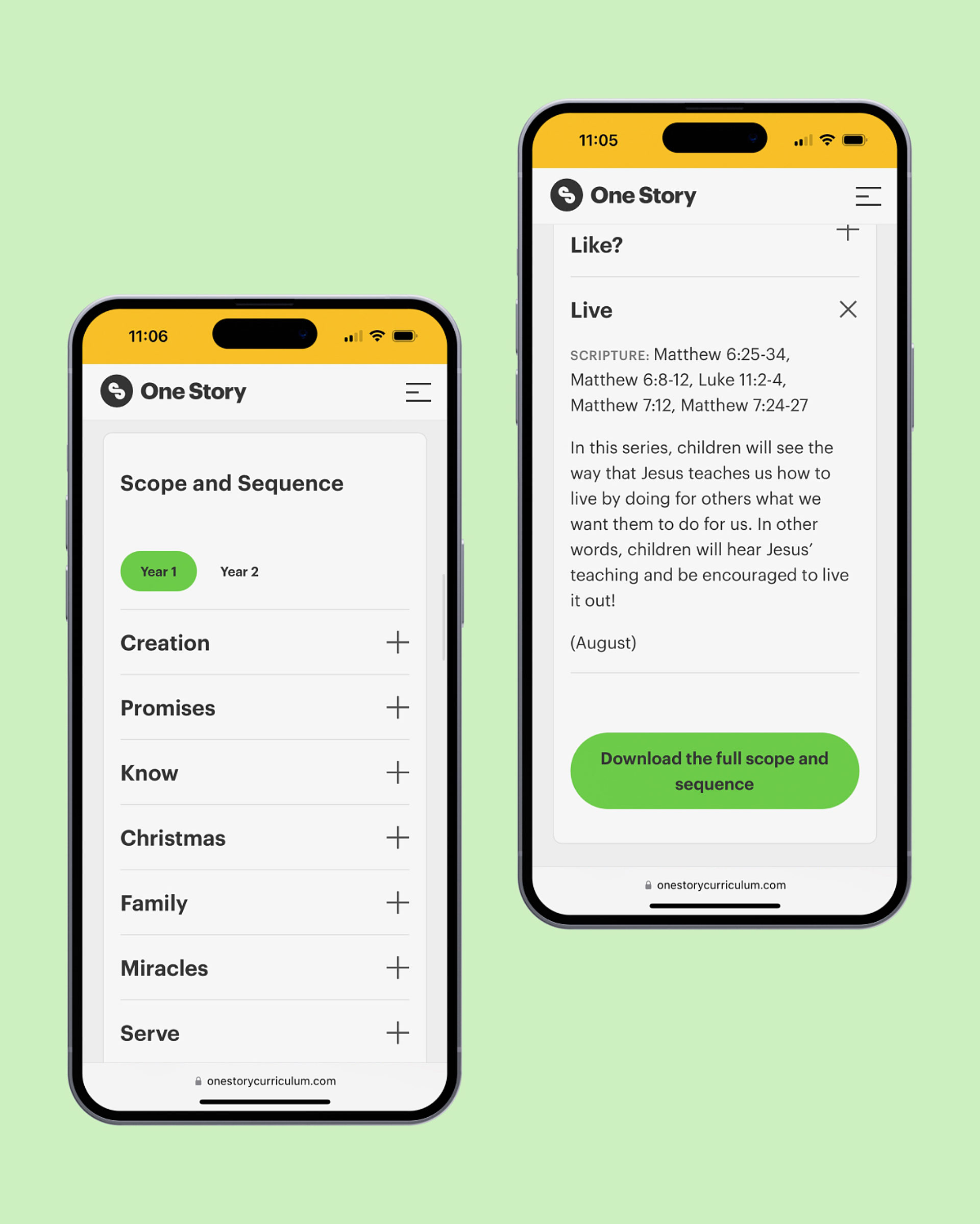
For each age bracket, a detailed curriculum page includes the full scope and sequence for that age range.
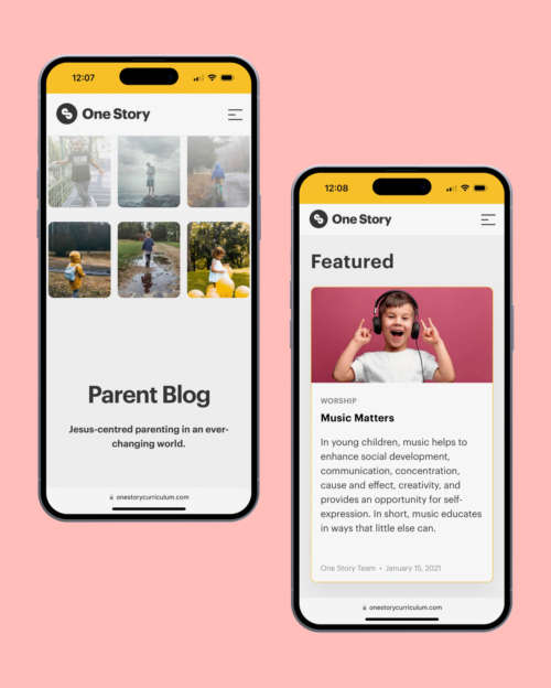
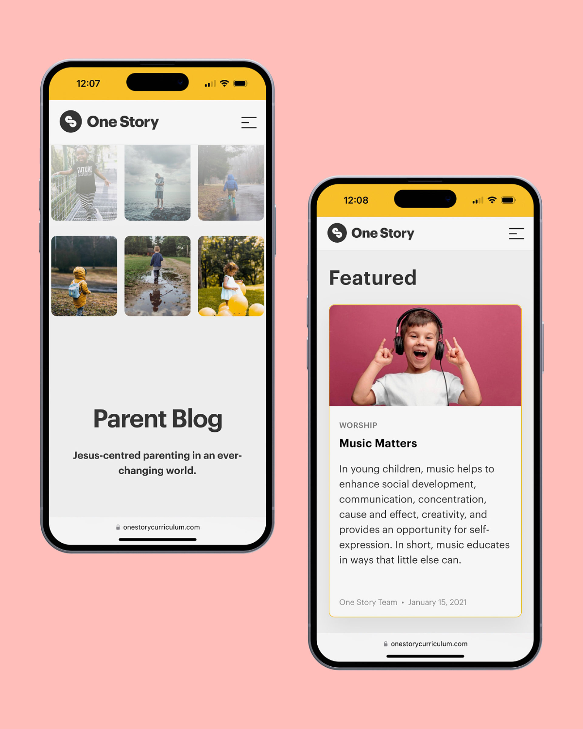
A blog lets One Story share tips and tricks for parents who want to engage with the material with their kids.
“Nathan has been a dream to work with from the beginning to end of our project. He not only designed and built a beautiful, creative and functional website that met our objectives, but he was able to partner with our team right from the beginning to understand what we wanted to accomplish through the project and partnered with us to come up with the best solutions to get us there. From creative designs to writing in copy to fill our gaps, he wasn’t just trying to get the job done, it felt like he had joined our team and was working with us to achieve our objective.”
Chris Vandijk The Meeting House


