A magazine-inspired design
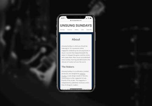
Unsung Sundays is a self-initiated side project and digital-only music magazine that started as a Tumblr blog. When the archive became so large that Tumblr was no longer the right choice, I designed and developed a website that was flexible enough to hold all of Unsung’s content. The new website was home to album reviews, interviews, list articles, and even music video debuts.
A design that sings: Using colour to denote meaning
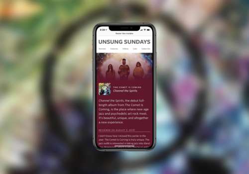
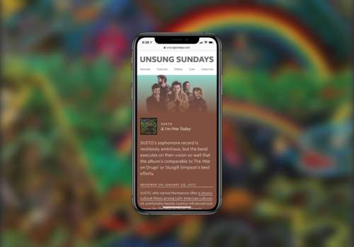
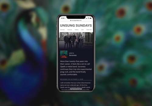
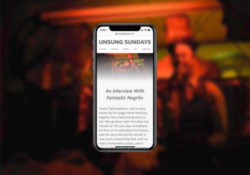
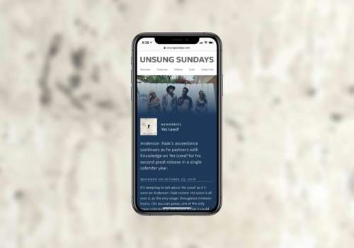
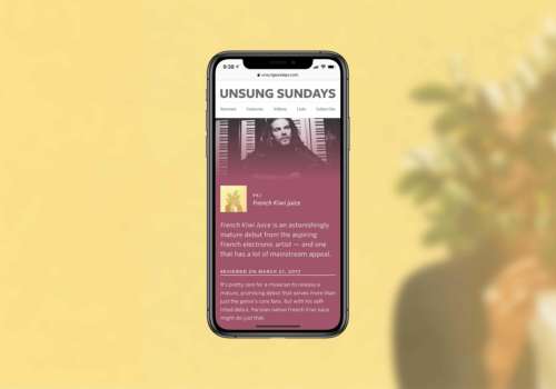
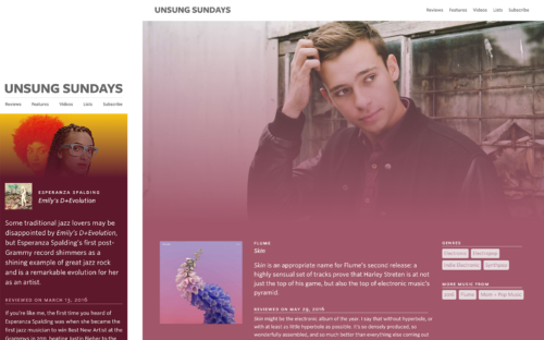
Unsung’s new design uses colour to denote meaning. Every genre gets its own colour. Hip hop is blue, electronic is pink, jazz is a deep wine red, etc. This gives every album review a unique flavour. The website’s colour scheme programmatically adapts to new colours, so what appears to be a system with dozens of colours and gradients is actually just a small handful.
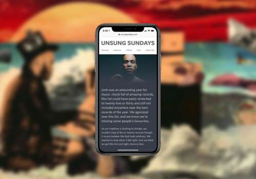
Large, full-bleed images are meant to be immersive hooks wrapped in vibrant colours. Album art is given prominent display (and sometimes, the colour of the album art complements the colour of the page — which is magical when it happens).
Designed for legibility: Readability was a priority
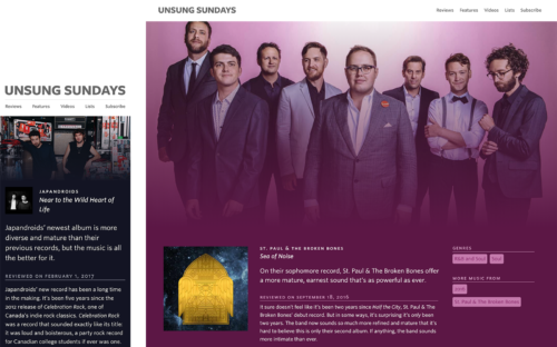
The overall reading experience was of the utmost importance. Unsung is a site people will visit every week. Making that weekly experience good was important. Special care was taken in selecting a typeface (Whitney by Hoefler & Co.), and to the line length and padding. No matter what device you read the site on, you’ll have a phenomenal experience.
Easy to browse: A proper way finding system
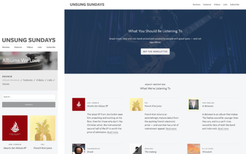
Browsing reviews, lists, feature stories, and issues needed to be easy and fun — so each category on the site has a unique design. This, along with the colour schemes, helps readers orient themselves and prevents confusion. It’s a subtle way to use design as way finding.
The results: Frankly unbelievable
In a period of six months, I saw a 900% increase in month-over-month visits to the site, and a several fold increase in engagement. There were acquisition talks and discussions about financial partnerships. Every week, people write in to say Unsung has impacted the way they discover music. Musicians, including some signed to major record deals, often request to be reviewed, featured, or interviewed.
Unsung Sundays is proof that good design is a worthwhile investment for any serious organization. Good design sells.
- 900%
- Increase in monthly visitors
- 700%
- Increase in on-site engagement
- 1
- Acquisition offer
