A new vision for The New Quarterly
The New Quarterly — TNQ, for short — is one of Canada’s most prestigious and longest-running literary journals, known for wit, warmth, and literary innovation. They publish short fiction, poetry, and creative non-fiction, and they’re known for debuting fresh Canadian voices that later become critically acclaimed best-sellers. TNQ’s writers are frequently nominated for and win many of Canada’s highest literary awards.
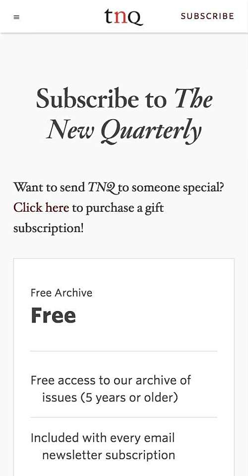
When The New Quarterly wanted to create a proper digital edition of their magazine, they decided it would make also sense to overhaul their entire online marketing approach. I worked with them to create one website that let people subscribe to the magazine, read it, and and buy swag. Our goals were to create a new revenue stream of digital-only subscriptions, with much of TNQ’s archive of award-winning writing freely available online for students and aspiring authors alike.
“As a designer, working with a committee can be difficult: you took initiative while still being conscientious about our needs, and making us feel heard. In the end, the website is beautiful and something we can all be proud of, while meeting industry and design standards. We’re very happy.”
Sophie Blom Managing Editor, The New Quarterly
The whole enchilada: Everything in its right place
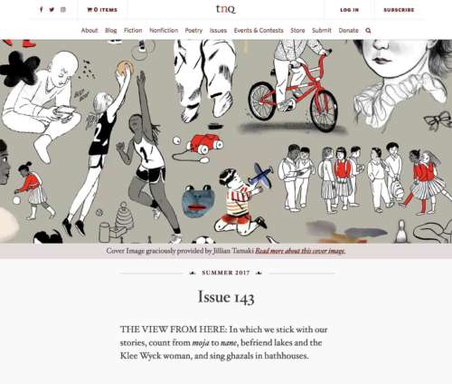
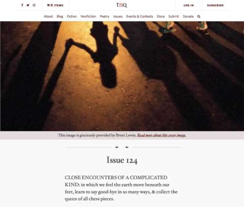
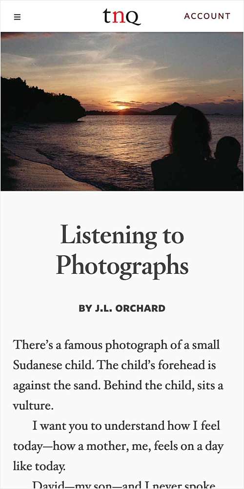
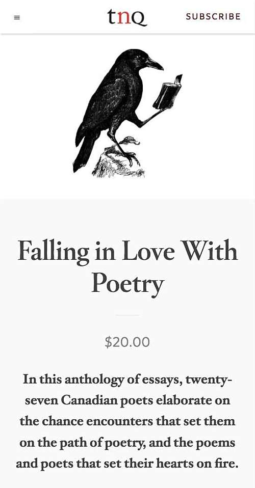
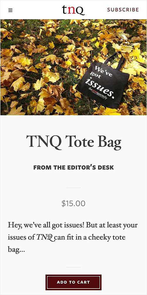
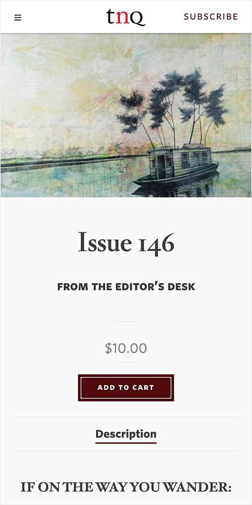
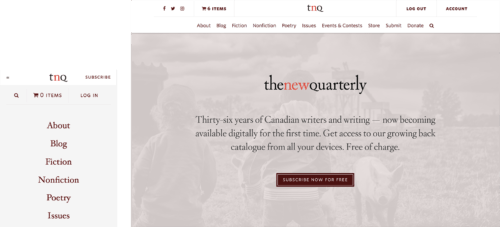
TNQ’s new website is more than just a way to read their magazine. It also provides ways for readers to manage their subscriptions, buy official TNQ swag, and read behind-the-scenes material on the blog. The website allows nearly every single story TNQ has ever published, across all 150+ of their printed issues, to be readable online. And the entire website is mobile-friendly.
Despite all that, it’s easy to find what you’re looking for on the site. Most features are just one click or tap away. The website is also dynamic, changing automatically with each new issue of the magazine. The editors never have to think about it. It just works.
Poetic license: A home for all kinds of content
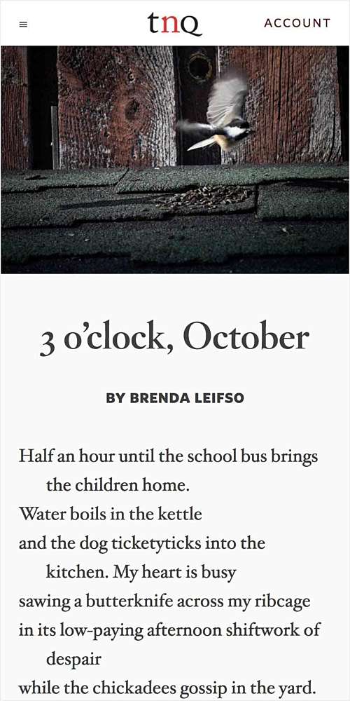
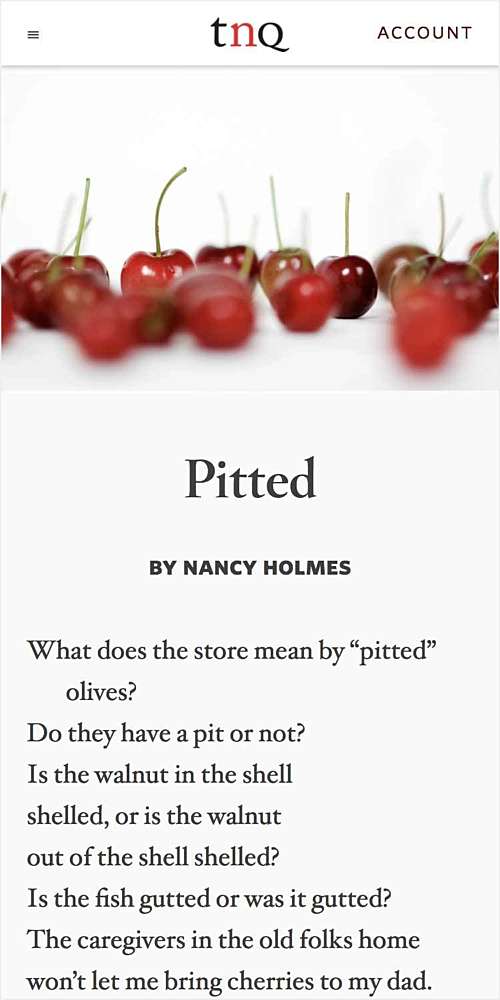
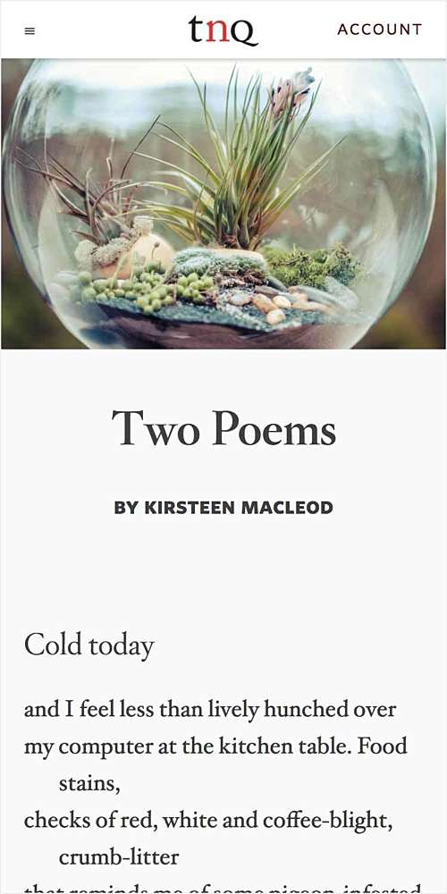
There isn’t an HTML syntax for poetry, but a core part of The New Quarterly’s experience is its poems. I created a custom architecture designed for poetry, building on existing HTML standards. With their new website, TNQ’s poetry feels right on phones, tablets, and desktops, and it’s a system that’s custom-built to their specific needs.
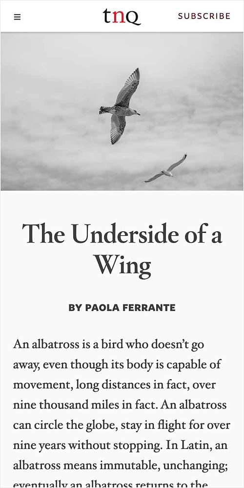
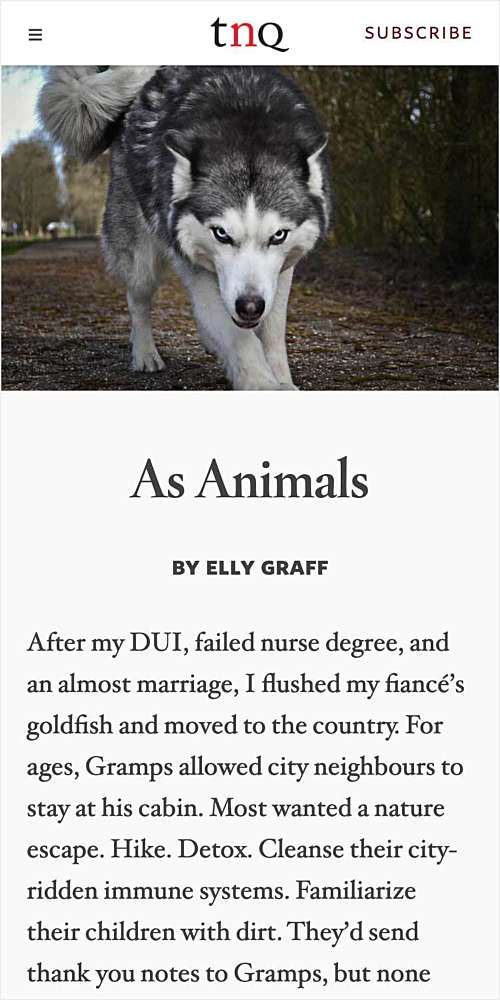
Prose looks great too — and, as it turns out, so do comics. No matter what TNQ publishes, their website can handle it.
Everything is for sale: An e‑commerce system for subscriptions and swag
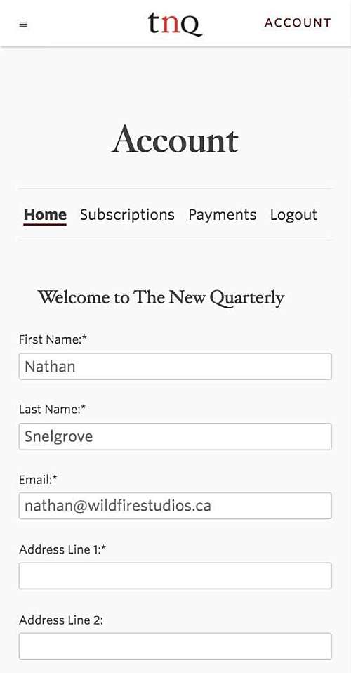
The website includes e‑commerce systems for managing subscriptions and selling swag. The New Quarterly can even sell tickets for their big events and writing competitions. For visitors, the experience is seamless. They can order products, subscribe to the magazine, buy tickets to events, and even manage their subscriptions in one place.
This also helps TNQ cut back on their administration every week. All their subscribers can manage their own accounts, tickets sell themselves, and their product inventory is automatically managed by their website. They spend less time doing admin work and more time making a magazine.
Family resemblance: Print and web to match
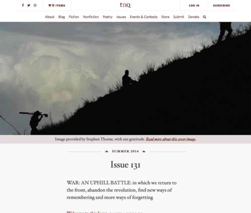
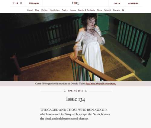
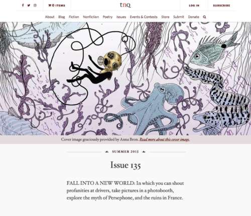
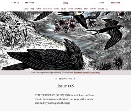
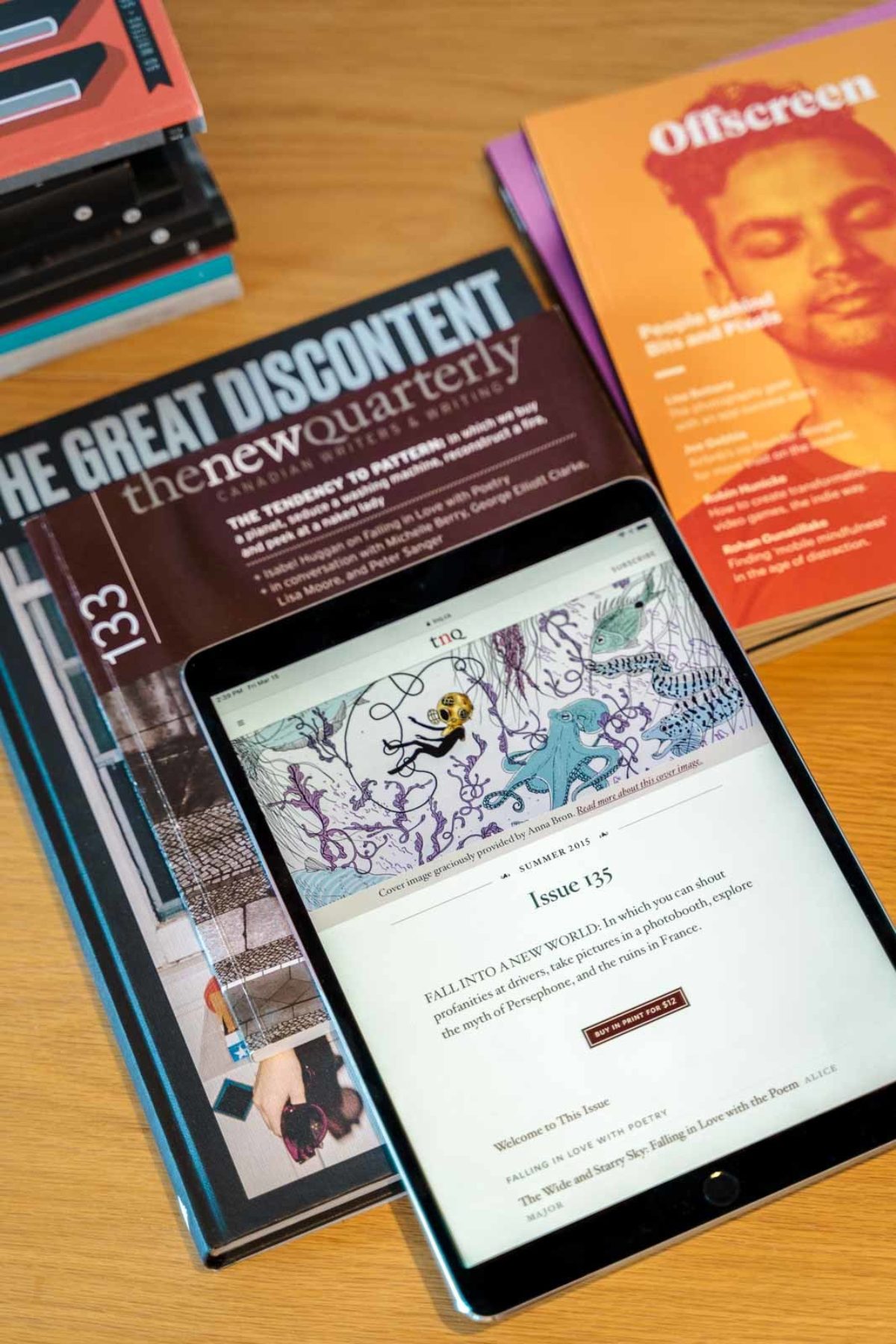
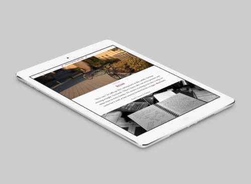
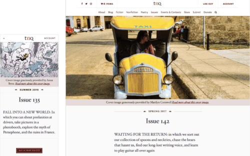
Great pains to ensure that TNQ’s digital design felt synonymous with their print magazine. They have a remarkable synergy. Even the digital Table of Contents feels similar in style to the printed edition. The website is dynamic and evolves as TNQ adds more content, but in everything from imagery and colours to typeface selection, it’s unmistakably like its print sibling.
The Results:
Everything is way, way up
TNQ’s numbers increased by 60% — 100% after launch, and have seen consistent growth in the years since. Within a month, visits to the site were so far beyond expectations that TNQ outgrew their hosting package. New visitors went up by 95%, and visitor sessions went up by 110%. These numbers continued for the first year after launch, and in the second year of the new site, YOY growth continued at 30%.
Digital subscriptions, which were possible before with a PDF system, have skyrocketed over the past two years. There are now thousands of people who subscribe to The New Quarterly online. Over fifty issues of the magazine are now available digitally.
Readers love the new site, and spend significantly more time on the new site than the old one for every visit. More people return to the website than ever did before. And finally, The New Quarterly was Typewolf’s Site of the Day on October 7th, 2016, less than a month after launch.
- 95%+
- Increase in new visitors
- 110%
- Increase in total sessions
- >200%
- Increase in subscriptions

