The brief
After more than twenty-five years of business, Keith’s business was changing. When CMA Ontario began transitioning to CPA Ontario, Keith was required by law to update his logo, business card, brand assets, and — yes — his website.
When I started talking with Keith about the possibilities, he jumped at the chance to make his website better. I worked with Keith and his team to make them a website that reflected their personalities and what they do. I wanted to make it clear: Keith and his team might have almost a quarter century of experience, but they’re more forward-thinking and playful than any of their peers.
Out with the old, and in with new
Keith’s previous site was built in-house with GoDaddy’s website builder. It was surprisingly semantic and ranked well in Google Search, but it didn’t match his brand. There wasn’t any easy way for them to update their services. There was no way for them to share any news. Changing an image was like pulling teeth, and since there was no documentation, people forgot how to make changes over time.

Keith’s old home page: a bastion of GoDaddy design.
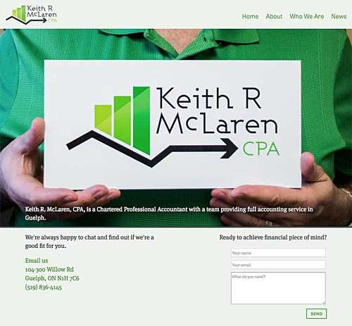
Keith’s new home page: a stalwart of personality!
The new website solves all the accounting firm’s problems. Its playful tone and imagery matches their personalities. It’s built on a modern CMS, so it’s easy for Keith and his staff to make changes if they should so desire. It has a built-in blog, it’s very easy to change images, and it came with detailed documentation.
The website includes a contact form in the footer of every page of the site, so clients don’t have to look for the Contact page every time they want to call their Keith. And, of course, the site is responsive, and looks amazing on little phone screens.
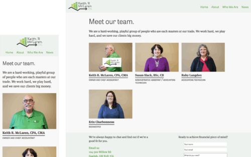
An accounting firm with a personality
My research was surprising: Keith’s clients unanimously said they looked forward to seeing Keith and doing their taxes with him. For most people, doing taxes falls somewhere between having a cavity filled and a colonoscopy, but Keith’s clients said filing taxes was a joy! It turns out that, beyond accuracy, people value accountants with good personalities.
My priority was emphasizing the personalities of Keith and his team with their website. I wanted to capture their senses of humour, and make it clear that they’re not just people you call for a tax return. I wanted their website to be as delightful as they are.
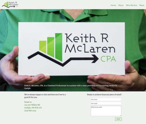
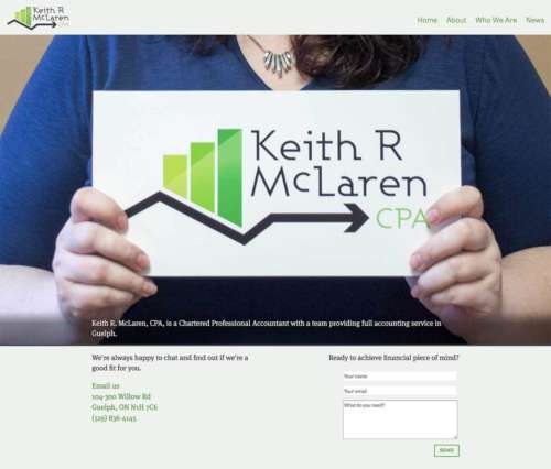
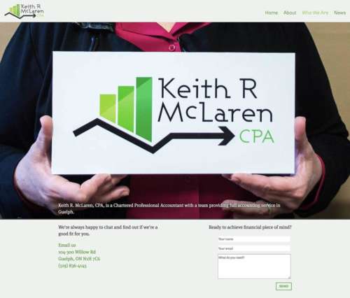
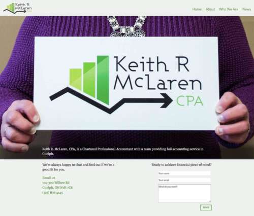
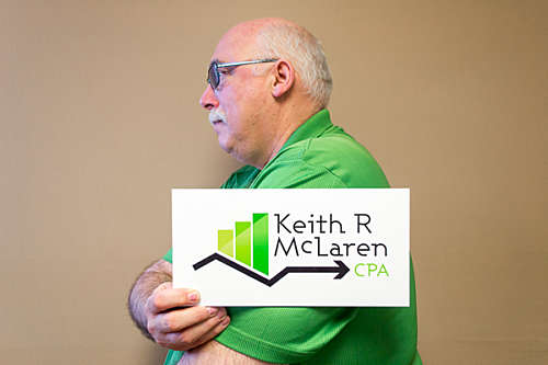
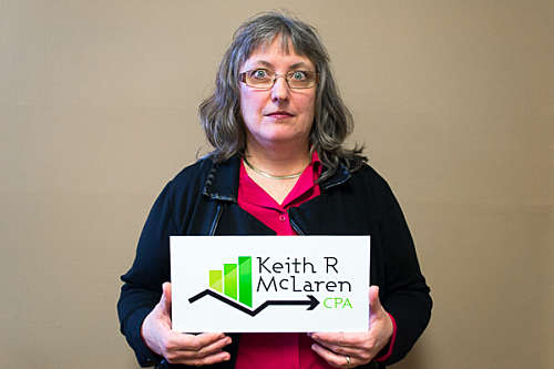
I took a selection of headshots that put a spotlight on the team’s personality. Everybody got to do a serious one, and a “prison mugshot,” as if they were stuck filing tax returns for all eternity. Those images get used all over the website. They’re featured on the Team page, the individual bio pages, and they even rotate out on the home page. When you refresh the home page, you’ll get a random selection of a zoomed-in mugshot image featuring a close-up of Keith’s signage.






“Working with Nathan is a great experience. He teaches, coaxes and refines your image when it is hard to do it yourself.”
Keith McLaren Owner, Keith McLaren, CPA
