The brief
Crossroads Prison Ministries offers a series of Bible-based correspondence courses for people in prison across Canada. Their instructors (who they call mentors) are a large group of trained volunteers who mark each course and respond to each lesson. In 2019 alone, over 1,000 inmates enrolled in the program for the first time.
When the head office of Crossroads US rebranded the organization, I was hired to create a new website for centred around this branding for the Canadian team. The website had to market the ministry, allow for donations and a gift catalogue, and resource their mentors.

A marketing tool
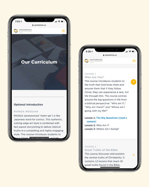
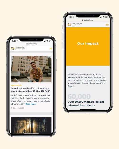
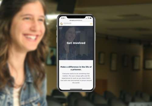
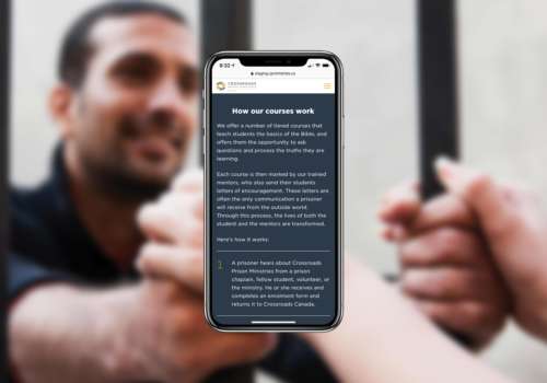
For potential donors and partners, the Crossroads website fills a crucial marketing role. I designed and developed a series of marketing tools, including easy ways to learn more about Crossroads’ impact, read stories from students and mentors, and explore and preview the curriculum. The Courses page offers an easy way to learn about each tier of education in Crossroads’ program, and is fun to browse on desktop and mobile. The website also includes an Impact page, which is regularly updated to reflect the recent numbers.
A complete e-commerce solution
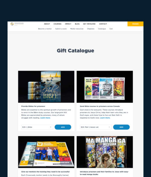
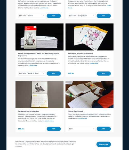
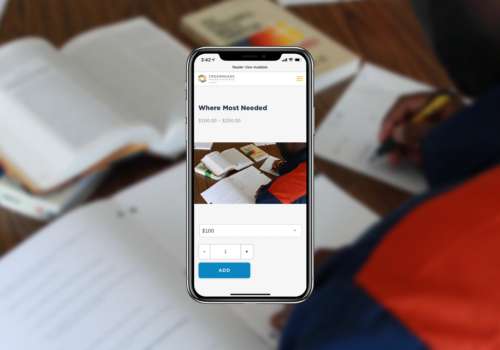
The Crossroads website fully supports e‑commerce. It allows donors to give one-time or monthly gifts. It also allows them to browse a catalogue and financially support specific needs, so they know exactly where their money is going.
A resourcing tool
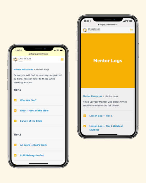
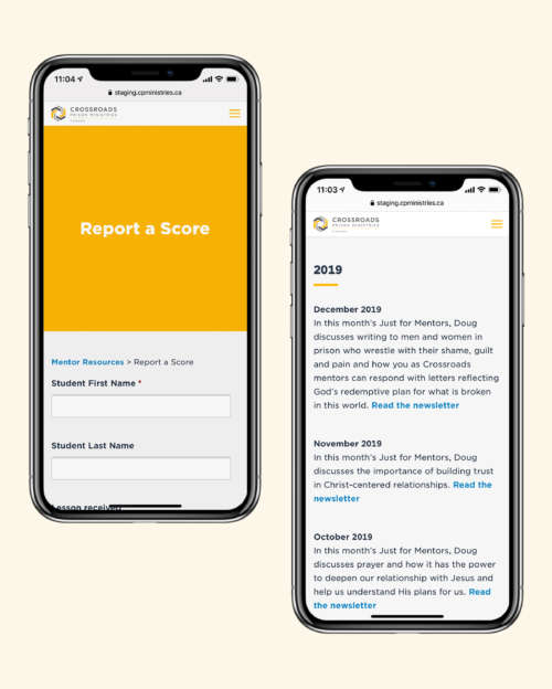
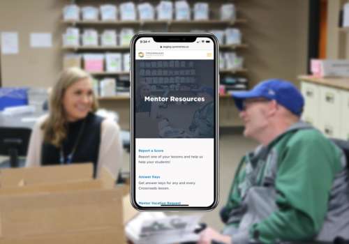
The website was designed with the needs of mentors and chaplains in mind. It includes everything they need to mark their students’ lessons. Whether they need to submit their scores, grab more answer keys or logs, or read the monthly mentor newsletter from the US office, all that and more is available in one place on the website — with more to come.

Product photography
Every item in the Crossroads catalogue required custom product photography. Crossroads needs help paying for everything from postage and mentor training to Bibles and courses.
The photos in the catalogue needed to share a similar look and feel. Each photo was captured inside a small lightbox with black background material, and was carefully shot to minimize glare on glossy surfaces.


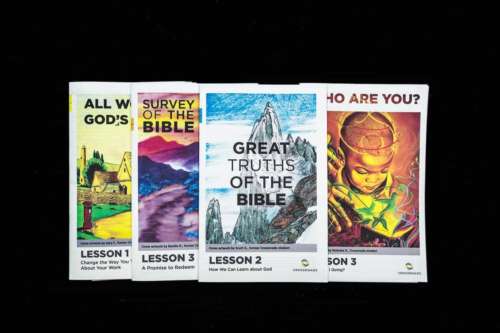


Crossroads’ website lets them gather dozens of courses and lessons in one page, and makes it easy to browse their course material. A simple tap or click reveals lesson details for each course in every tier. Each course includes one lesson sample. Because there are so many courses, we focused on making them easy to browse and understand — without making the list instantly overwhelming.

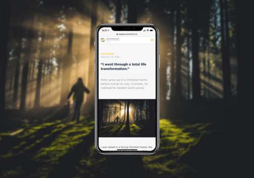
Crossroads’ blog collects news, student testimonies, and even photo galleries for student art or recent events. The blog houses a diverse collection of content and powers most of Crossroads’ digital marketing. The archive is designed to be engaging and draw people in — even if they’re not comfortable with prison ministry.
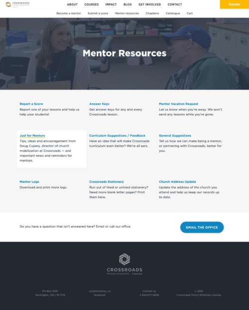
All the mentor resources are easily accessible with just a single click, and are easy to navigate on mobile thanks to large tap targets. The websites’s back-end architecture makes it easy to add, remove, or modify resources as need be, and the resources are constantly evolving. With so many resources available, we focused on streamlining the selection process for volunteers and making it easier to get from Point A to Point B.
The results: an increase in online giving of 339% in just two years
Over two years, the growth of Crossroads Canada skyrocketed from donations alone. In the first year, online giving was up by over 160%. In the second year, giving went up more than 60% again after a few small tweaks to the donation flow. In two years, online giving went up 339%.
That’s not all: support for mentors decreased after the initial transition period to the new website. Everything they needed was in one place. Even though Crossroads was perennially understaffed, their mentor support decreased with the website in place, saving their small admin team precious time.
“Nathan has been an integral part of developing and establishing our ministries’ website and communication tools. His creative and excellent writing skills and ability to keep the big picture in mind is exactly what our ministry needed. He continues to help us develop new resources, while keeping our message and brand consistent and clear. We look forward to working with him in the future and we will gladly recommend him to any ministry or organization.”
Martie van Niekerk President, Crossroads Prison Ministries Canada


