Studio Missive #7: fixing website designs that look broken in iOS 26
Happy Friday, friends! This week, a client said to me: “This week is twenty weeks long.” I’m here to tell you I’m barely aware what year it is, and if I still wrote cheques, I think I’d be dating them for 2023.
Anyway. Here’s what’s inspiring me and what I’m working on this week.
What’s inspiring you?
- “This isn’t burnout. It’s the moment you realize you’ve adapted so well to dysfunction that you can’t hear your own voice anymore.” Greg Story’s brilliant Eject Disc is a manifesto for those of us who need to rediscover who we were before we got sucked into the vortex.
- Stuart Breckenridge wrote about his experiences updating NetNewsWire’s design for iOS and iPadOS 26 and for macOS 26. I love reading little behind-the-scenes stories like this and getting previews of what’s coming. I also have been thinking a lot about this over the past week (see below). (Unrelated to that, Breckenridge also designed an amazing Star Trek-inspired theme for NetNewsWire in the past week. I’m not even a Star Trek guy and I love it.)
- Jack Conte, who is the founder of Patreon, gave a talk last year on the death of the follower and the future of creativity on the web. The product that my client launched last week is a media platform focused on giving creators control over their content. I’m optimistic that what we released is phase one of this plan, and I’m looking forward to building more on it. I missed Conte’s talk last year, but watching it this week felt validating. My client and I had many of the same conversations while designing the product. (I still can’t share that project yet; please give the engineers some time.)
- Did you ever want a website to become more energy-efficient based on the cleanliness or dirtiness of your electricity grid? Because, well, that’s possible now. When we talk about Responsive Web Design, the term is starting to become much more holistic than it used to.
- I find colour science and the way colours work in computers fascinating. My head is still spinning after the introduction of oklch, which was a colour space we got the ability to use on the web just a few years ago. (I keep meaning to use oklch on this website; my brand’s yellow colour is much more vivid than sRGB allows.) If everything I wrote is gibberish to you, then you might be interested in Making Software’s detailed article on what a colour space is and how it works. (And even if you understood what I wrote, you almost certainly will learn something new.)
What are you working on?
This week, I finally caved in and installed the public beta of iOS 26 on my iPhone. I’m not a huge fan of the new design (although I will admit it’s nice that buttons are back in style), but I wanted to test out my clients’ websites and apps on the platform.
And I’m very glad I did, because the changes to Safari are wild.
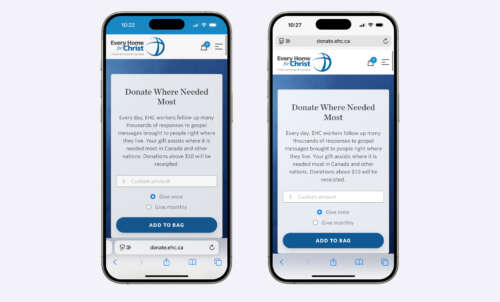
In iOS 18 and below, there are two ways to configure Safari’s browser chrome. They are both “boring,” but in a good way. The browser’s chrome has no effect on the website itself. I’ve taken a couple screenshots of a real live client website so you can see how it looks currently:

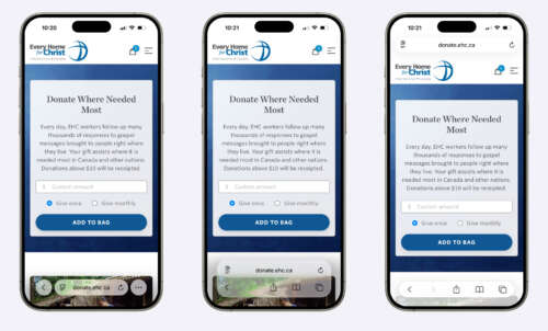
Regardless of what you think about my design work, the browser UI is efficient and doesn’t get in the way. In iOS 26, that’s changed. There are three different ways to configure Safari’s chrome, and all three potentially create design challenges. Here’s the same website again, but in iOS 26:

Note that the browser chrome now floats over top of the website. Does it look cool? Yes. Does it also suck? Yes. Both can be true at once.
One client this week (not related to the screenshot) saw their website in the new UI and called it a four-alarm fire. In their own words, Apple’s broken the cardinal rules, and their UI now adversely affects your own. (And this says nothing about how it looks on iPadOS 26 or macOS 26, both of which are somehow worse.)
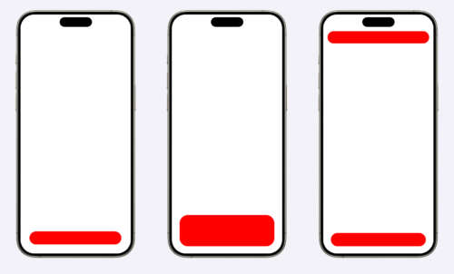
In the previous design, I had nothing to worry about. The browser was my canvas. Now, my canvas is encroached upon by Apple. I took the liberty of mocking up the problematic areas:

This may not be obvious from my red shapes, but each of those pills is a different width. I’m not joking. You can’t even consistently rely on the padding. (If you’re a developer, you are going to need to start using safe-area-inset on a lot of projects. Here’s the documentation.)
This is not the first time I’ve written about this, but using iOS 26 in real life is a whole different deal.
So this week, I’ve spent a lot of time updating website designs around Apple’s UI.
It should be said that I have never had to consider Apple’s UI while designing websites before. This crosses a line for me. An unspoken agreement between Apple and designers like myself has been broken, and unfortunately for myself and my peers, a number of previously-good web designs will need to be reconsidered to accommodate a browser vendor’s recklessness.
Thanks for reading! I hope that my update next week is less angry, but there is shockingly little coverage of the changes to Safari. It feels like, if I’m going to be this annoyed by it, I might as well be the one who writes about it.
In the meantime, have a great weekend, and I’ll catch you again next Friday.
– Nathan