Redesigning a web app’s components for iOS 26 and Liquid Glass
This year, Apple has announced a far-reaching redesign of iOS, the operating system for its phones. Thanks to the redesign, I had to redesign some components of a web app for client. What follows is the change that impacted me most, how it broke things, and how I had to fix it.
Liquid Glass goes on Safari
Apple’s redesign of their platforms incorporates a new theme for the system (called “Liquid Glass”), but also radically reshapes how some of its apps look and feel. Apple, of course, made a marketing video about the design (embedded below).
Apple has a number of video resources aimed at teaching people how to use the design as well, some of which paint the design and Liquid Glass in a better light. “Meet Liquid Glass” and “Get to know the new design system” were both excellent for me as I got started on understanding Apple’s new designs and learning how it affects my existing work.
The changes that have caused me the most grief are the changes Apple has made to Safari. Apple has redesigned the URL bar and the window chrome of the entire application, which upends many previously good assumptions about the way my work is presented to end users.
I made some simple mockups to illustrate the changes I’m talking about:

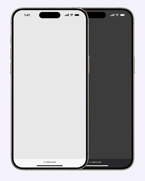
Before: Safari in iOS 18, before the user has scrolled.


After: Safari in iOS 26, before the image has scrolled.
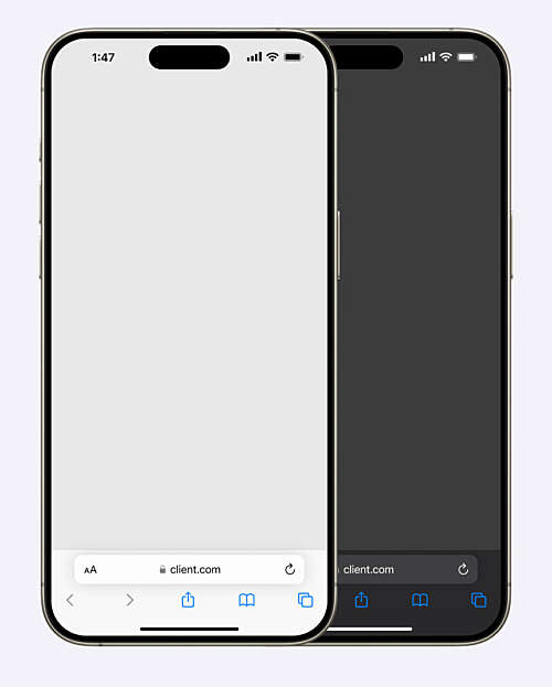
This is what a webpage looks like before you start scrolling, when the URL bar is expanded so you can see the domain. You might notice from the screenshot that, in iOS 26, the URL bar is now split into three different tappable regions: a back button, the URL bar itself, and a “More” menu disguised as an ellipsis.
When you scroll, the UI changes.

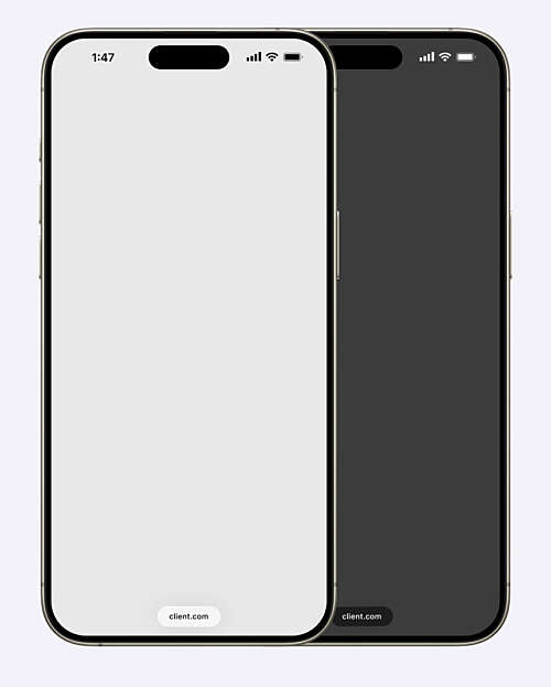
Before: Safari in iOS 18 in its scrolled state.

After: Safari in iOS 26 in its scrolled state.
In iOS 18, the URL bar minimizes. Controls are no longer visible. The bar spans the width of the device. In iOS 26, the URL bar minimizes, but retains its pill shape. It floats in the middle of the screen. The back button and the ellipsis menu have disappeared.
This new design creates problems for existing applications.
The miniplayer problem
One of the key components in my client’s web app is a miniplayer for currently playing audio. The miniplayer is fixed to the bottom of the viewport and always accessible, even while the user is scrolling or navigating to other pages of the app.
In iOS 18, that miniplayer looks like this:
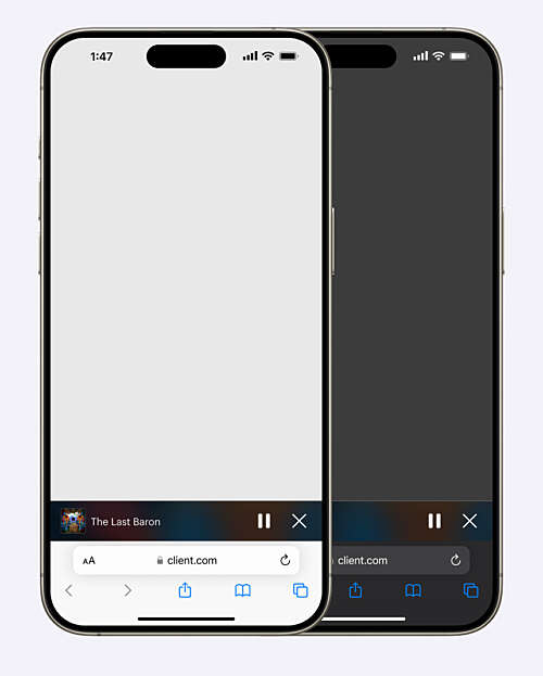

The current miniplayer in iOS 18, before the user has scrolled.

The current miniplayer in iOS 18, in its scrolled state.
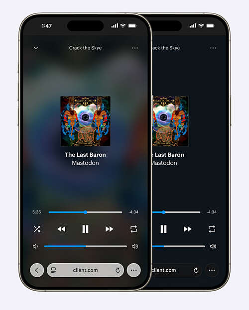
Tapping anywhere on the miniplayer will open an expanded player (not unlike Apple Music or Spotify’s approach, which is a timeworn and battle-tested way to solve this problem). The expanded miniplayer looks like this:
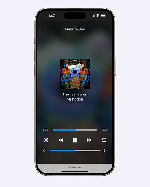

Light mode in iOS 18

Dark mode in iOS 18 (it looks almost identical)
This miniplayer was a lot of fun to design. I was inspired by my memory of Rdio, a long-defunct Spotify competitor. It used album art for the background of its miniplayers. I loved that experience, and wanted to do something similar as a sort of homage to my all-time favourite music app.
In the case of the screenshot above, the album in the miniplayer is Mastodon’s Crack the Skye. The background colour is a blown-up, blurred version of their album art, with a slightly opaque dark layer above it to enhance legibility for the white text.
Thanks to the changing background, it’s extremely dynamic, and it adds a little bit of whimsy to the app.
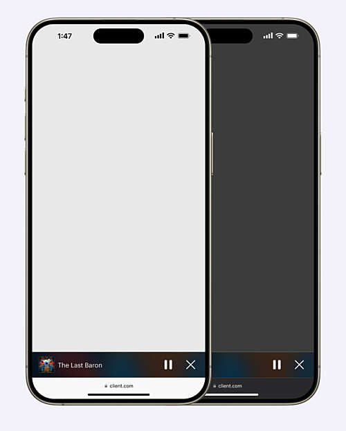
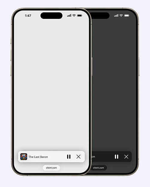
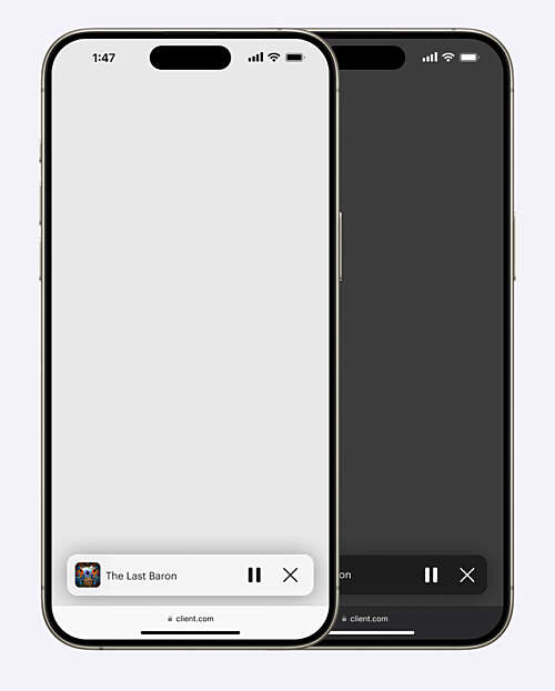
The design of the floating tab bar in iOS 26 changes that. While my designs still work, they look odd to me in the beta versions of the operating system. I have made an approximate recreation of the problem below.

The current miniplayer in Safari on iOS 26, in its unscrolled state.
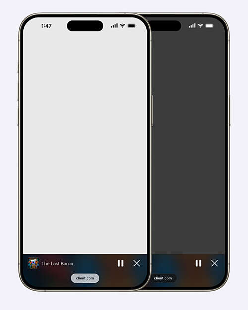

The current miniplayer in Safari on iOS 26, in its scrolled state.
Not only does this look worse (and feel worse in use) than it did before, but it is harder to parse the design in dark mode in particular.
When the client and I reviewed this, we agreed that it didn’t present the client at their best. My design suddenly looked, through no fault of my own, very dated.
So we went back to the drawing board.
Redesigning a component for iOS 26
In Safari, Apple’s browser controls sit above the content, and allow the content to bleed through what they call “Liquid Glass” controls. In an Apple-provided screenshot below, you can see that the colours bleed through all the UI, and that the buttons end up elevating themselves above the content itself.
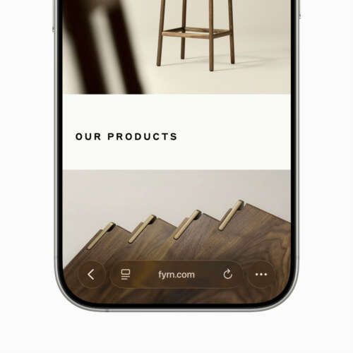

Image courtesy of Apple. In this closeup, the brown background clearly affects the UI.

Image courtesy of Apple. Note the website background affecting the browser's UI.
Replicating Liquid Glass is inadvisable in a cross-platform application like this one. People who use Android devices, or Windows machines, would have Apple’s UI choices thrust upon them. A harmonious machines for Apple users would be jarring for the other half of the population. A clear design goal for us is to make something that’s comfortable, beautiful, and usable across any operating system and device. I had to design something that resembled Apple’s UI without making it jarring anywhere else.
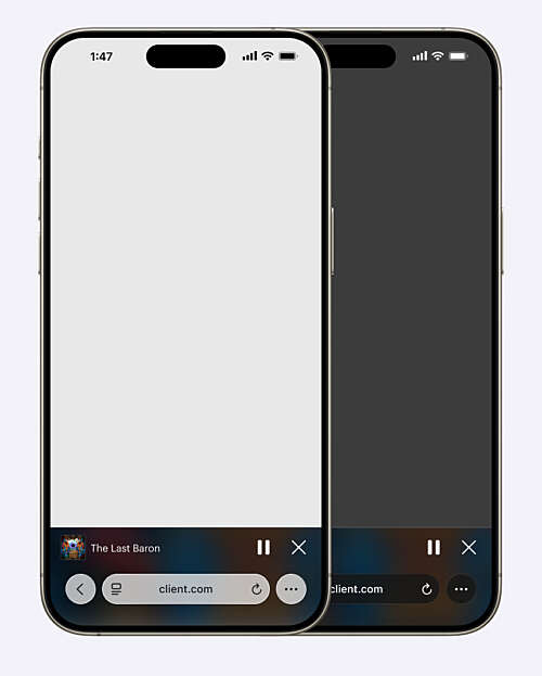
With all that in mind, allow me to introduce the redesigned miniplayer. It floats above the content, removing it from the surrounding window chrome. I gave it extra dimensionality with deep shadows, background blur, and slight transparency. Rounding the borders more generously helps the design blend in with multiple operating systems.
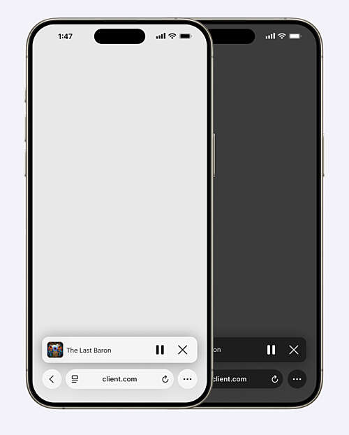

The redesigned miniplayer in iOS 26, before the user has scrolled.
The redesigned miniplayer in iOS 26 after the user has scrolled.
Two things you may or may not notice right away:
- This design requires a light mode and a dark mode variant, unlike the previous design. To the best of our ability, we want to match the appearance of the browser UI. It would be disconcerting to see a light miniplayer beside dark buttons.
- I was irked to strip the personality out of this component, but I have to admit the redesign makes it more readable and helps it pop more. (No client ever complains about a little extra “pop”.)
One final thing: this miniplayer will also be used in the iOS 18 (and older) versions of Safari. It has to look good there as well. The image below demonstrates how this will look in the future:

The new miniplayer design in iOS 18, before the user has scrolled.

The redesigned miniplayer in iOS 18, in its scrolled state.
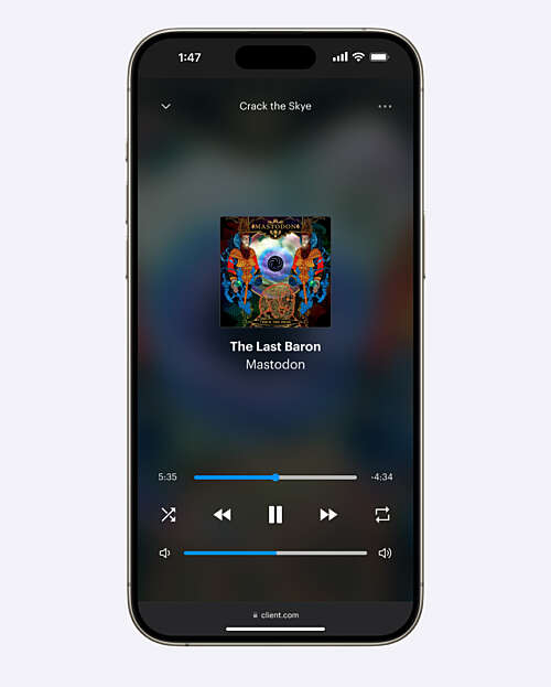
If you’re wondering about the expanded version of the mini player, we plan to continue using it for now. We think the existing mini player is a good opportunity to impart some of the whimsy I shared earlier, and we don’t think it will negatively impact usability. But we have a new design ready to go in case users find the existing design difficult to parse in Apple’s new design language.
Take a look at the current expanded miniplayer design in iOS 26 and its possible replacement below. You’ll note that the possible replacement has a light and dark mode, rather than one design that is used in both instances:

The current design of the expanded miniplayer on iOS 26.
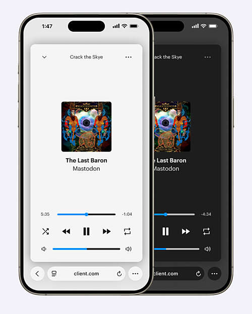

The potential redesigned expanded miniplayer in iOS 26.
Before and afters
I’ve made a couple before and after shots for an easier comparison. Both images use the scrolled browser state, since that is what I think most users will see most of the time.
Here is the before and after for iOS 18 (the current version of iOS as of August 2025):
The current miniplayer in iOS 18, in its scrolled state.
The redesigned miniplayer in iOS 18, in its scrolled state.
And here is the before and after for iOS 26, coming fall 2025:
The current miniplayer in Safari on iOS 26, in its unscrolled state.
The redesigned miniplayer in iOS 26, before the user has scrolled.
Like all OS-level redesigns, iOS 26 challenges many assumptions designers have made for years about their work. Whether or not you like the direction Apple is going, a redesign is always an opportunity to make things better for everybody — including users on legacy devices. This component is a small piece of a larger platform, but I’m pleased with the result, and I think it’s going to make this app better for everybody who uses it.