A wild idea
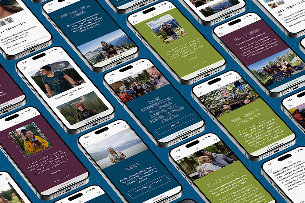
Girl in the Wild is a non-profit that provides free confidence building camps for girls and women in the wild. The ladies at Flipside designed a new website for the non-profit, but they needed somebody to take the design and execute it to perfection. Using Craft CMS, I built a website that loads fast, handles whatever kind of content they want to throw at it, and offers them the flexibility to build out whatever they need in the future. Visit the website.
Rich content layouts
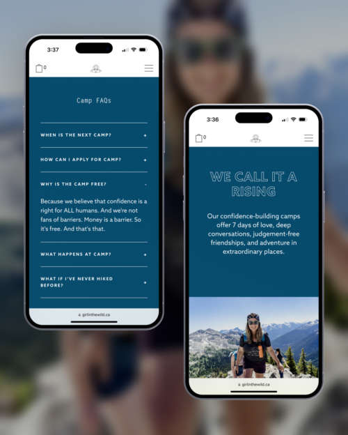
Every page on the Girl in the Wild website has a flexible layout that can adapt to the non-profit’s needs. Whether they need sections that split images and text in the middle, giant headers filled with text, background patterns behind text, testimonials, FAQs, a site banner, or just about anything else they can imagine, they can quickly built it all out and modify it as they go.
E-commerce and donations
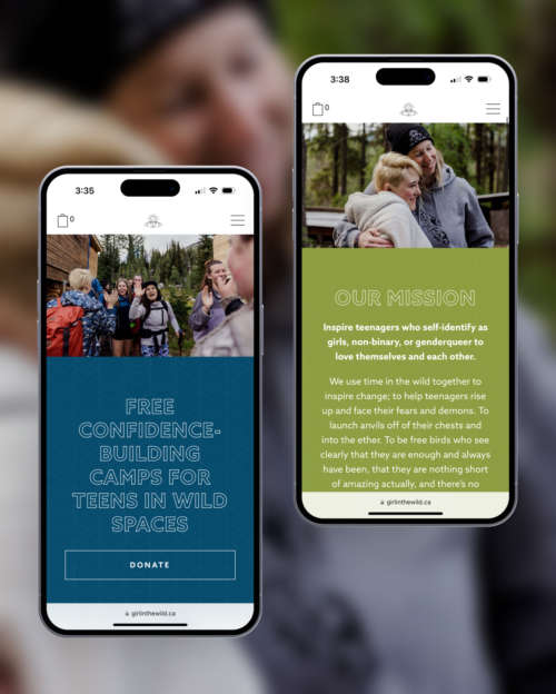
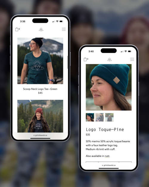
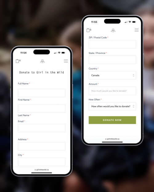
The Girl in the Wild website uses Snipcart to process merch purchases and a simple form to collect donations. Merch is extremely flexible, allowing for everything from inventory management to settings inventory limits in the cart. The donation form allows Girl in the Wild to collect one-time or recurring donations with as much ease as a contact form.
A platform for sharing stories
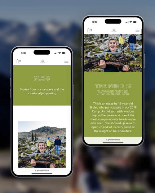
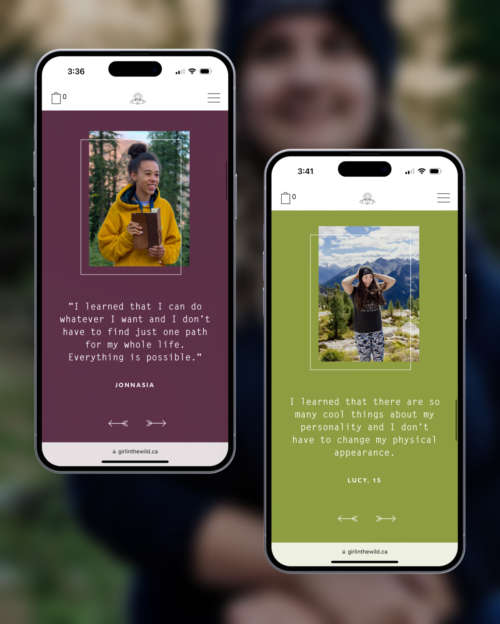
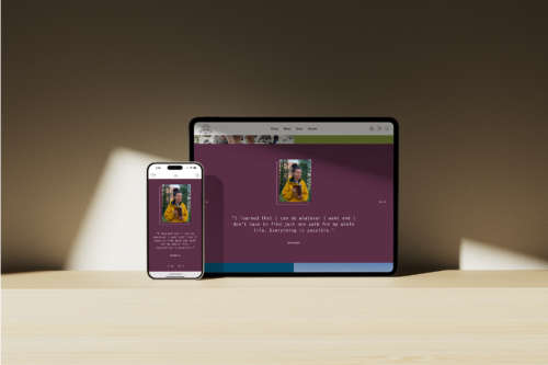
The website supports blog posts, testimonials, and various image elements that allow Girl in the Wild to make their website as dynamic, vibrant, and alive as they are. Adding any of this content takes just a few clicks, and there are virtually no ways for the site editors to accidentally create designs that fall outside of the brand’s requirements. There will never be a white screen of death on this website!
From XS to XL: From the big screen to the small
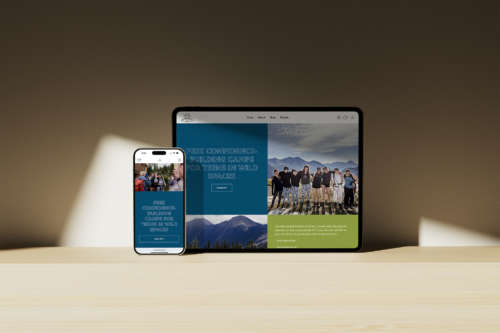
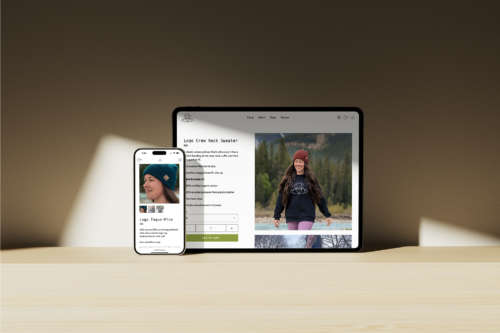
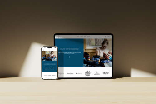
The Girl in the Wild website is fully responsive, and scales from the smallest to the largest display with ease. Whether you’re using a small phone, a tablet, a giant TV, or an ultrawide display, the Girl in the Wild website responds to your needs and scales accordingly.
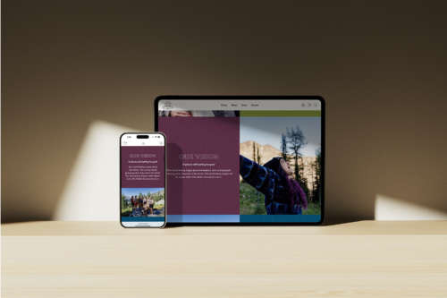
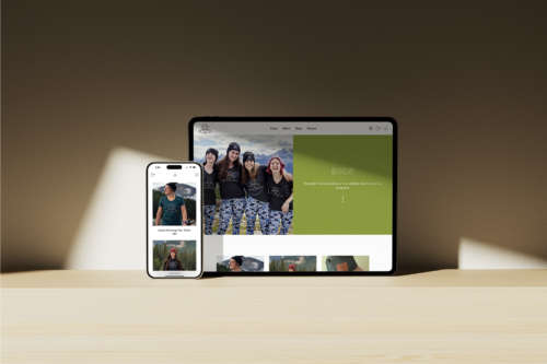
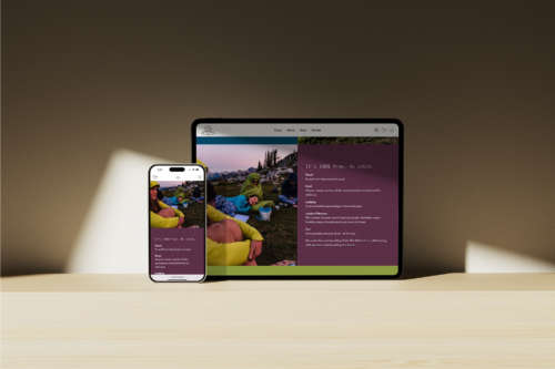
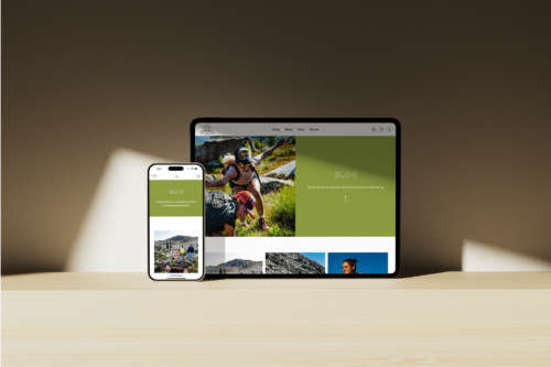
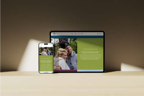

It’s easy for Girl in the Wild to quickly build out entirely custom landing pages. The About page (pictured on the right) swaps between a full-bleed page header, numerous split image/text sections, testimonials, a form to collect interest in the next camp, and FAQs. There are so many options this page doesn’t use! The content on the page can be re-arranged into any order just by clicking and dragging, and can be assembled in less than 10 minutes.
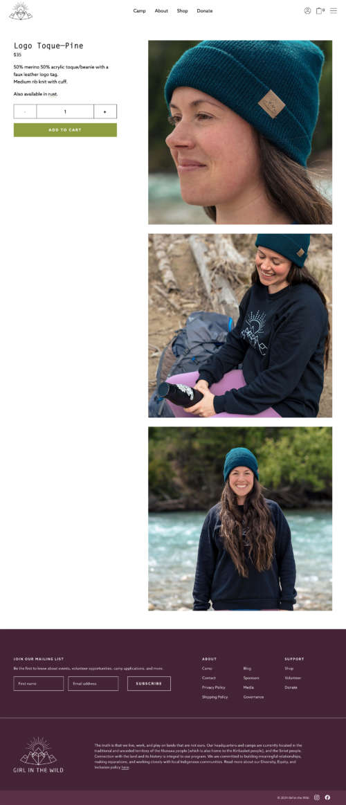
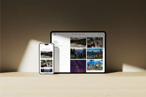
Products are flexible, easy to add, and put a huge spotlight on their imagery. While scrolling, the text to the left remains in one place, making it easy to look at photos while reading the product description. Products can have managed inventory, be added or removed at any time, and beautifully resize for mobile viewing.

The donation page is as flexible as any other landing page, making it possible for Girl in the Wild to have specific landing pages for different campaigns. Donations can be one-time or recurring, and the form can easily be duplicated and re-used elsewhere. For the end user, making a donation is as easy as filling out a contact form.
“We wanted a development studio that could bring our lofty vision for our non-profit website to life. And we had a feeling that Wildfire Studios was the right choice from the beginning. We were not wrong. Nathan was timely, attentive, and insightful. He offered better and alternate solutions when he had them and made it really easy for our team to learn how to update the site on our own. We never felt like any question we asked was stupid. And we asked A LOT of questions. He’s also hands down one of the nicest guys we know. We adore our new site and are so grateful for Nathan’s expertise.”
Kim McMullen Founder, Girl in the Wild


