The brief
EHC doesn’t make gospel tracts. They partner with churches, small groups, and individuals through their Finding the Hope outreach program. Through Finding the Hope, EHC provides resources and material that creates community and sparks conversations.
Over the years, EHC has created a shared visual aesthetic for all their programming. The shared aesthetic develops familiarity, which makes their outreaches easier for people on both sides of the conversation. Their printed material is dynamic and engaging, with clear calls to action, but it never becomes pushy or off-putting.
EHC wanted new websites that lived up to the same standard. They wanted responsive websites that were engaging, dynamic, easy to navigate, and with clear calls to action so their visitors would know how to get involved. But most of all, EHC wanted their websites to all share a cohesive aesthetic.
One framework. Many possibilities.
To make their new websites happen, I designed and developed a beautiful, responsive theme framework that could be used and leveraged across multiple websites and experiences. They can grow with EHC’s needs, but they remain easy to use. Navigating the websites is easy, even on mobile. And there are clear calls to action on almost every page.
All this helps give the new websites a shared visual language and aesthetic, but also gives them the opportunity to stand on their own.
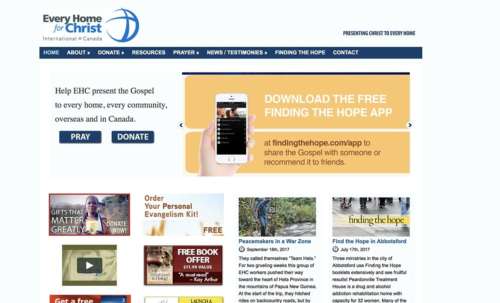
EHC’s old home page. Reminiscent of a bygone era.
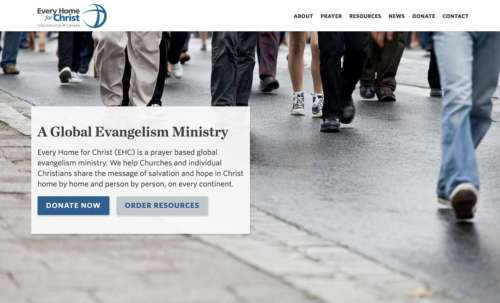
EHC’s new home page: magnificent splendour, a phoenix rising from the ashes. Clear, obvious, and classy.
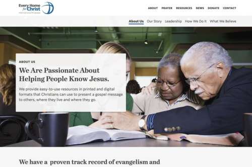
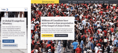
The new theme in use on EHC’s corporate website
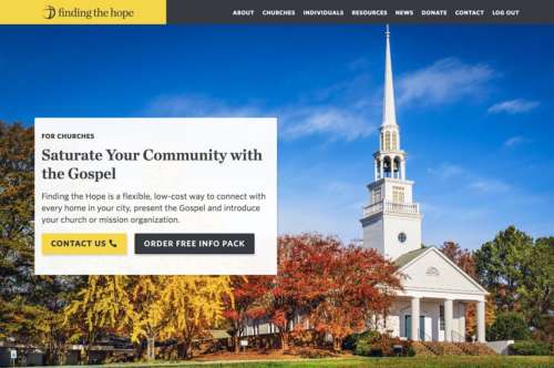
The new theme in use on EHC’s outreach website for Finding the Hope
We launched two new websites on the same day — one for EHC and one as a resource site for their primary outreach program (called Finding the Hope). These websites have a shared visual language and aesthetic, but also stand on their own. While nobody would confuse one website for the other, they would recognize them as part of the same family.
And above all, the websites would appear familiar to anybody who’s spent time with EHC’s print materials.
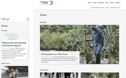
Not just a website: A platform for storytelling
I wrote a content strategy for EHC that should help bring focus and clarity to how they share their story online. We learned that people want to hear more about the impact charities and non-profit organizations make. As we collect data about how people find their way around the websites, we’re going to continue tweaking the design of the blog. But this is an important step forward for EHC.
For the first time, EHC is able to tell stories about the impact they’re making online. This opens a lot of doors for them and breaks a lot of barriers, and I’m excited to continue making this experience even better over the coming months.
An e‑commerce system built for a non-profit
EHC’s e‑commerce system is tailored to their specific needs. While we could have used something like Shopify or WooCommerce and called it a day, I wanted to build a more flexible system. This system needed to be as easy as shopping on Amazon for visitors, but it also needed to take EHC’s needs as a non-profit evangelism organization into account.
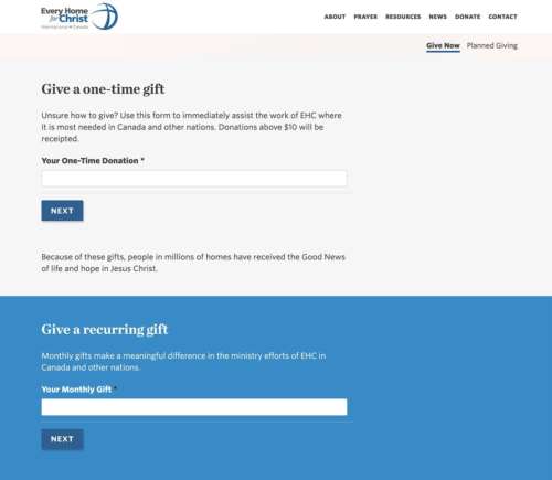
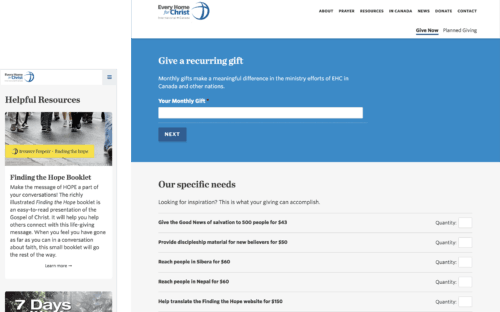
The new e‑commerce system allows EHC to build out catalogues of their missions opportunities and resources, accept monthly or one-time donations, and even send free resource kits to interested people or churches. It automatically informs EHC’s office about any orders or purchases, and allows them to more easily automate their mailing lists and receipting process. It also links to Stripe, which makes reporting easy and payment collection fast. And their CMS and e‑commerce system can be managed from the same integrated back-end.
This system creates a whole new world of opportunities for EHC. For the first time, they’re able to collect donations online by credit card. They can manage their inventory online. They can turn their ordering process into an opportunity for a long-term relationship with a donor. And to top it all off, because everything is integrated into a single system, their admin team saves hours of time every week.
New branding for Finding the Hope
As part of the website project, I was asked to also redesign the brand identity for one of EHC Canada’s subsidiaries, Finding the Hope. The brand had to include EHC’s glyph, use yellow like the existing logo, and use a serif typeface like before. This had to be a subtle re-brand that would allow the logo to support many more applications, including the new websites.
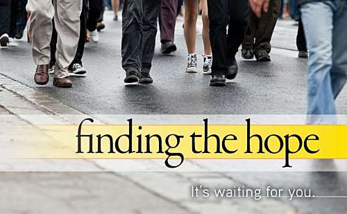
Before
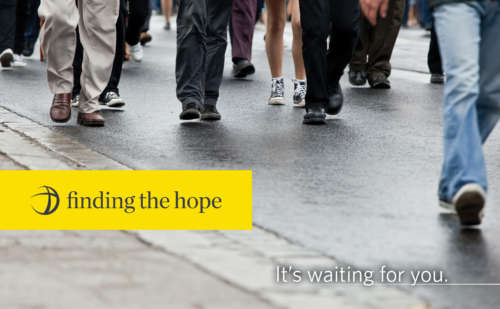
After
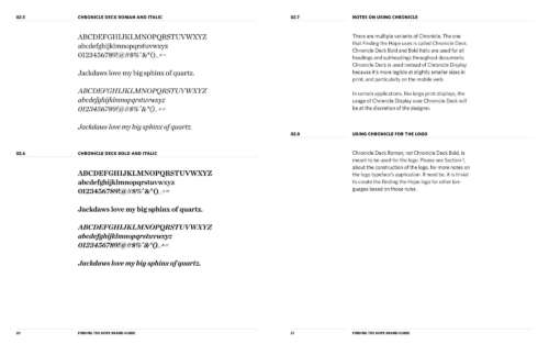
The new logo is just as bright as the original, and arguably friendlier. It does away with gradients, which make it much easier to use the logo in large print projects and even small digital apps. It replaces Minion from Adobe with Chronicle from Hoefler, which is more legible at small sizes and better for tight spaces. The new logo is better in small spaces, like the mobile websites, in every possible way.
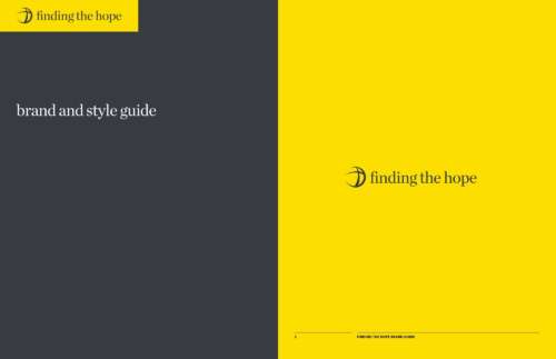
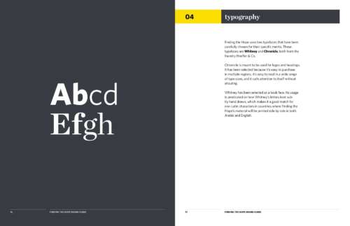
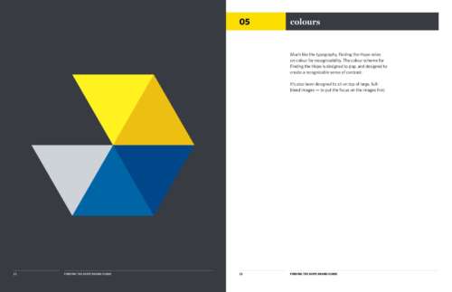
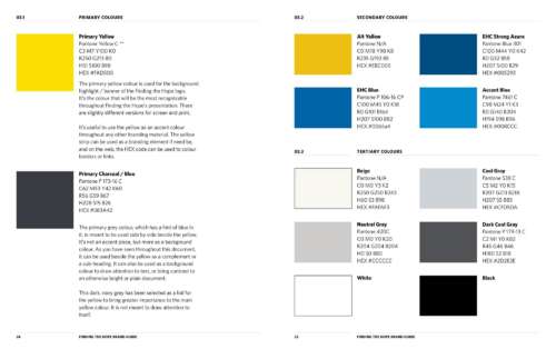
I also designed a complete brand guide for the new Finding the Hope identity. The guide covers the type system, the spacing around the logo, the available colours, and the preferred imagery for the brand. It digs into more than the brand elements: this guide explains the philosophy behind the branding.
The brand guide is also fun to read. The best documentation is the sort that’s clear and fun. Since the re-branding, this document has become an irreplaceable guide for the ministry as they expand the ways they use Finding the Hope in their ministry.
Laying the groundwork for the future
The new framework is flexible. It lays the groundwork for all sorts of long-term visions EHC has. It finally lets EHC accept donations online, display their catalogue of missions opportunities, and quickly and easily update their resources. Better yet, it helps EHC tell the stories of what’s happening in the missions field. Their new blogging architecture and design is going to make a big difference as they begin to share more and more content online.
But don’t just take my word for it. Take a look at EHC’s new website, and their new resourcing website for Finding the Hope. Bring ears to hear.
Update: You can also read this blog post to learn about the technical considerations that went into making each site multilingual.
“Nathan is an organized thinker with great peripheral vision. He is not just a designer; he is a strategist. He is able to anticipate what’s coming in the dynamic world of technology, knows how it will impact his clients, and lays a digital foundation so they can take advantage of it. He finds innovative solutions to challenging problems. One of Nathan’s gifts is helping his clients present their messages in a way that is clear, compelling, and organized. We would recommend Nathan to any organization who needs a digital strategist, designer, or developer.”
Jacqueline Dugas Vice President, EHC International / Canada


