Legal work that stands out
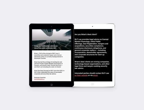
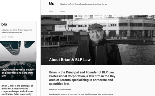
After five years in business, Brian Prill knew what his law firm was and where it was going. He approached me to create a brand identity and website for him with a simple instruction: he wanted to stand out from the crowd. He wanted his website and his logo to have some panache, but he also wanted his branding to be clear and immediately reach his target audience — busy people with serious legal needs. I created a brand and a website that stands out with stark black and white details and a glossy look and feel that looks great on the web and in print.
Simple branding: A clear identity on law
The law is complicated. Branding doesn’t have to be. BLP’s identity was all about style. Brian wanted to look a little different from all the other law firms in the city. I carefully selected a great typeface — one that nobody else in the industry was using (Acumin, from Robert Slimbach). That typeface is extremely flexible, and allows for all sorts of different applications and intents.
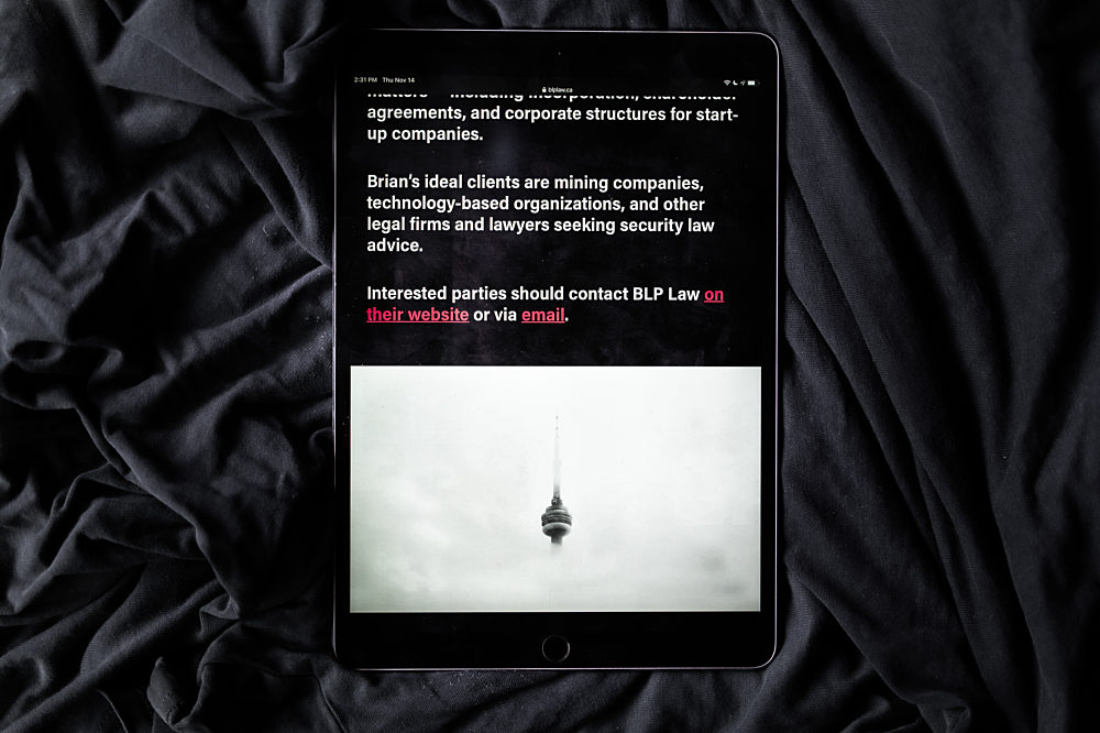
After that, we settled on a black and white colour scheme — with just a dash of red on the website. The black and white lends BLP Law a sense of professionalism and traditionalism, and the dash of red made the firm look youthful, daring, and bold.


A bold website
Instead of grids of photos or case studies, or even large pull quotes with testimonials, the BLP Law website had to go the opposite direction. Because of the private nature of his relationships with his clients, Brian’s site couldn’t feature testimonials or case studies. Instead, the BLP Law website features large, bold type to attract the reader’s attention.


