Studio Missive #9
Happy Friday! It’s that time once again. Here are a few things that are inspiring me, and a little bit of BTS at the studio this week.
What’s inspiring me
- There’s a company called Operate who are making some kind of new CRM. I do not care one lick about CRMs, but their website is freaking rad. One of my favourite new websites in some time, and it’s only a single-pager!
- On the topic of great websites, Matthias Ott’s new site has a settings panel that looks like a guitar amp. WHAT EVEN. It’s so ridiculous, but in a good way.
- And check out Rob Weychert’s new website. This guy has made the dream work: first, he’s got the coolest line art motifs on every page. Second, he’s managed to get all of his content, ever, on one domain. The guy has gone all-in on reclaiming his public identity from the massive social corps. This is some fantastic information hierarchy. He detailed and the work in a blog post, and I am genuinely impressed. I tried to do something similar on my personal site, but did not get anywhere near this scale or scope.
- Working Assembly has a case study about their beautiful branding for a bar (er, sorry, a lounge) called Pinky Swear. The type is awesome, and the logomark is inspired by the Rorshach test. Killer work.
- BasicAppleGuy made a blog post detailing macOS icon history. I miss a lot of the old icons. Look how great they all were from around 2010 – 2015. I know a lot of folks were sad about “the great flattening” of macOS, but it wasn’t until recently that I started to feel like we really lost something. Early on in the flat design era, the macOS designers were still cooking.
What are you working on?
This week, I am finally getting close to wrapping up design on one client’s website. We have two more weeks of work left to go for the design process. The last time I shared the work with you, I featured his stylescapes. We’ve come a long way since then! Here are a couple examples of the page headers for his landing pages:
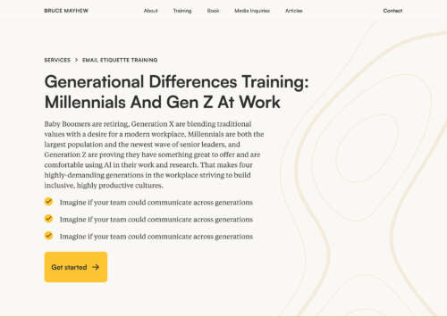

The page header for Bruce's Generational Differences Training (copy not final).
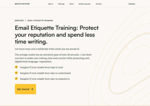

The page header for Bruce's Email Etiquette Training (copy not final).
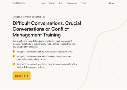

The page header for Bruce's Difficult Conversations Training (copy not final).
The motif of the topographical element really ties this together. If you take a look at the stylescapes I previously shared, you’ll see that this borrows from multiple elements of each stylescape: there’s the typography from one of the stylescapes, the topographical design flourishes from an another, and the art placement and direction of the third.
That’s what’s great about stylescapes: you quickly find a few ideas that are working, throw out what doesn’t work for the client, and can start iterating on some other ideas pretty quick.
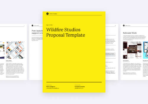

There were some other great things this week: I designed a new proposal template that I can use to respond to RFPs (oh, and I responded to a juicy RFP). I started seriously planning how a YouTube design show might work in my studio. (Ever tried to shoot a nice looking video in an 8×10 room? It’s a challenge. Actually, it’s more like thirty challenges, but you know, one thing at a time.) And I’ve wrapped up dev work on another website that’ll be ready to go as soon as the client passes over copy. It’s been a great week here — just one with very little sleep.
Next Friday’s update is going to be a little different due to some travel, but I’ll share more then.
Cheers,
Nathan
P.S. If you’re a web developer and you’re reading this, please read Richard Rutter’s post with his requests for Interop 2026, and upvote everything he’s recommended on Github. I really want hanging punctuation!