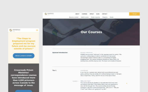
New Work: Crossroads Prison Ministries

Yesterday, I launched the new website for Crossroads Prison Ministries Canada. Crossroads is a non-profit. They provide Bible courses for prisoners in Canadian jails, and connect the prisoners with volunteer mentors. Their mentors mark the students’ lessons, and send them letters of encouragement. Their website needed to make their mission and offerings clear, as well as have a beautiful design that matched the new branding from the U.S. head office.
Of note, the home page has some fancy design tricks if you’re using a modern browser (and it scales down easily if you aren’t). It’s easier than ever to browse Crossroads’ offering of courses. And they finally have a page detailing their impact.
This is the first phase of the Crossroads re-design. Later this year, as more content gets added to the site, the blog will get another dramatic overhaul to make browsing its contents easier. We’re also building a gift catalogue in to the website, as a way of fundraising for Crossroads’ ministry.
In the meantime, the new website is a better place for Crossroads to share its story, attract donors, and train their mentors. I can’t wait to show you what else we’re cooking up. I’ll be sharing a detailed case study as soon as I can — but maybe not before we roll out the next couple phases of the site.
I hope you enjoy the website.