Scaling SVGs without scaling their strokes (2025 edition)
Two years ago, I wrote about inconsistencies I encountered while scaling line art SVGs without changing stroke width. At the time, vector-effect was broken.
Inspired by Josh Comeau’s introduction to SVG, I recently revisited the issue. Today, it mostly works (with caveats). Here’s what I found.
I had a reference design that I was working with, which I will share again below.
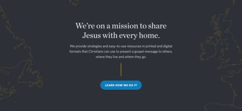

The SVGs I want to use are on either side of the hero text.
There were a few reasons this was important to me:
- While I could simply make these SVGs the
srcelement of animg, that increased the overall payload of the page, which I didn’t want. (Ironically, using a jpeg or a png file both save more space with this method, which is what I’ve had to resort to.) - If I can directly embed the SVG, I can change
stroke-widthandfillprogramatically, which comes in handy depending on thebackground-colourof the page, making the whole site more flexible and easier to work with. - Embedding the SVG directly appears sharper than using a jpeg or a png.
- And the most important part: if I could embed the SVG, I could theoretically keep the stroke width constant while the page resized, ensuring the design element was visible at multiple resolutions.
In 2023, this was broken. Today, it appears to work, with caveats.
My code remains the same:
<style>
svg {
	display:block;
	margin:0;
	width:100%;
	height:auto;
}
</style>

<svg viewBox="0 0 500 240">
  <path
    vector-effect="non-scaling-stroke"
    d="M10,20 L40,100 L39,200 z"
    stroke="black"
    stroke-width="1px"
    fill="none"></path>
</svg>
Today, this works. It works without using transform=scale(X,Y). I don’t know why it works or what changed. (I do know that vector-effect has had a somewhat buggy history going all the way back to 2018, which is a little discouraging, but hopefully those days are behind us.)
However, the implementation is not flawless.
To verify that this is working more or less as described, I took several screenshots at different viewports of the map in action, then zoomed in to 1200% in Photoshop. Then I took screenshots in Photoshop of the results. You will see that vector-effect is not flawless, but it’s close.
In these examples, it is tough to say if the problem is the vector-effect spec, or if the problem is Chrome’s implementation of the spec.
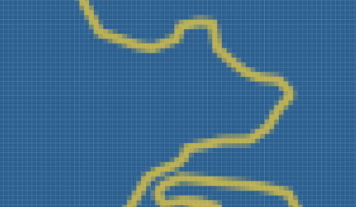
The map is in yellow. The background is blue.
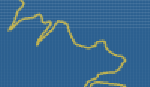

SVG line art in Google Chrome in a viewport smaller than the SVG's viewbox.
At this viewport size, when the SVG is smaller than the viewbox element, you can see from this zoom level that the stroke barely qualifies as one pixel wide. But it’s close enough, and the stroke width is much better than a resized jpeg or png file at the same size.
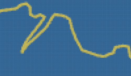

SVG line art in Google Chrome. The viewport is roughly twice the size of the viewbox.
In a larger viewport, it looks like the stroke is rendered at 2px wide. But again, this is close.
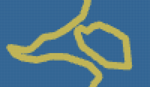

SVG line art in Google Chrome. The viewport is roughly three and a half times the size of the viewbox.
At a very large viewport size, Chrome renders this at a much chunkier stroke width of about 4px or so. This probably a dealbreaker for some art, but for my purposes, this works. It’s worth noting this is when the image has more than tripled the original size of the viewbox. At this size, this 300px wide SVG was being rendered at over 1000px wide.
In 2023, the situation was much more dire. vector-effect:non-scaling-stroke had the same rendering as vector-effect:none. With vector-effect:none, the stroke width appears at least three times thicker at large viewport sizes.
I do not know why Chrome still renders stroke-width:1px; vector-effect:non-scaling-stroke as a 4px stroke width at this size. Obviously, it’s a discrepancy. But without digging out Photoshop and zooming in to 1200%, I’m not sure I would have caught the error. It’s possible Chrome is accounting for some sort of optical illusion I haven’t considered in its presentation.
However, even at similarly large sizes, Safari behaves better:

SVG line art in Safari. The viewport is roughly four times the size of the viewbox.
As you can see, this is closer to 1px (with perhaps some antialiasing).
I will acknowledge my efforts here aren’t exactly scientific. My screenshots aren’t always the same dimensions, etc. I’m doing this quickly because I have a job to do. But the differences between how Chrome and Safari render vector-effect:non-scaling-stroke are obvious to the naked eye. Without zooming in to Photoshop, it’s clear that Chrome’s implementation is flawed, and Safari’s is closer to accurate.
That being said, this is so much better than it was in 2023. In 2023, I couldn’t use this technology in production, and wouldn’t recommend it to my client. As of August 2025, I can use this. Before, the spec was entirely broken in Chrome. Now, I am describing specific differences in the implementation of this spec between browsers. This is a marked improvement.
So it’s a good day.